

Butiá
Butiá is a handbag brand that embraces a new perspective on luxury: more understated, timeless, and connected to time. Inspired by the nature, landscapes,…
Ivan Canan is a writer, researcher, and university professor. Through his work, he transforms everyday experiences, reflections, and observations into chronicles that move seamlessly between humor, sensitivity, and critical thought.
When he came to IAP Studio, he had one clear objective: to develop a sophisticated, contemporary identity that would stand apart from everything typically associated with writers.
It was precisely this pursuit of the unexpected that became the starting point for the project.
From our very first briefing, one thing became clear.
Ivan did not want a brand built around literary symbols.
No feathers, books, typewriters, or any other elements that would literally represent his profession.
He also rejected another common path taken by brands seeking sophistication: the classic black-and-gold palette.
The challenge was never simply to create an elegant identity.
It was to create an elegance that was entirely his own.
A discreet, contemporary, and distinctive brand capable of reflecting his personality without relying on the visual codes already established by the market.
That was when we realized the answer might not lie in Ivan's profession, but in what truly made him unique.
During the creative process, one small detail caught our attention.
Both Ivan's first and last names end in exactly the same way.
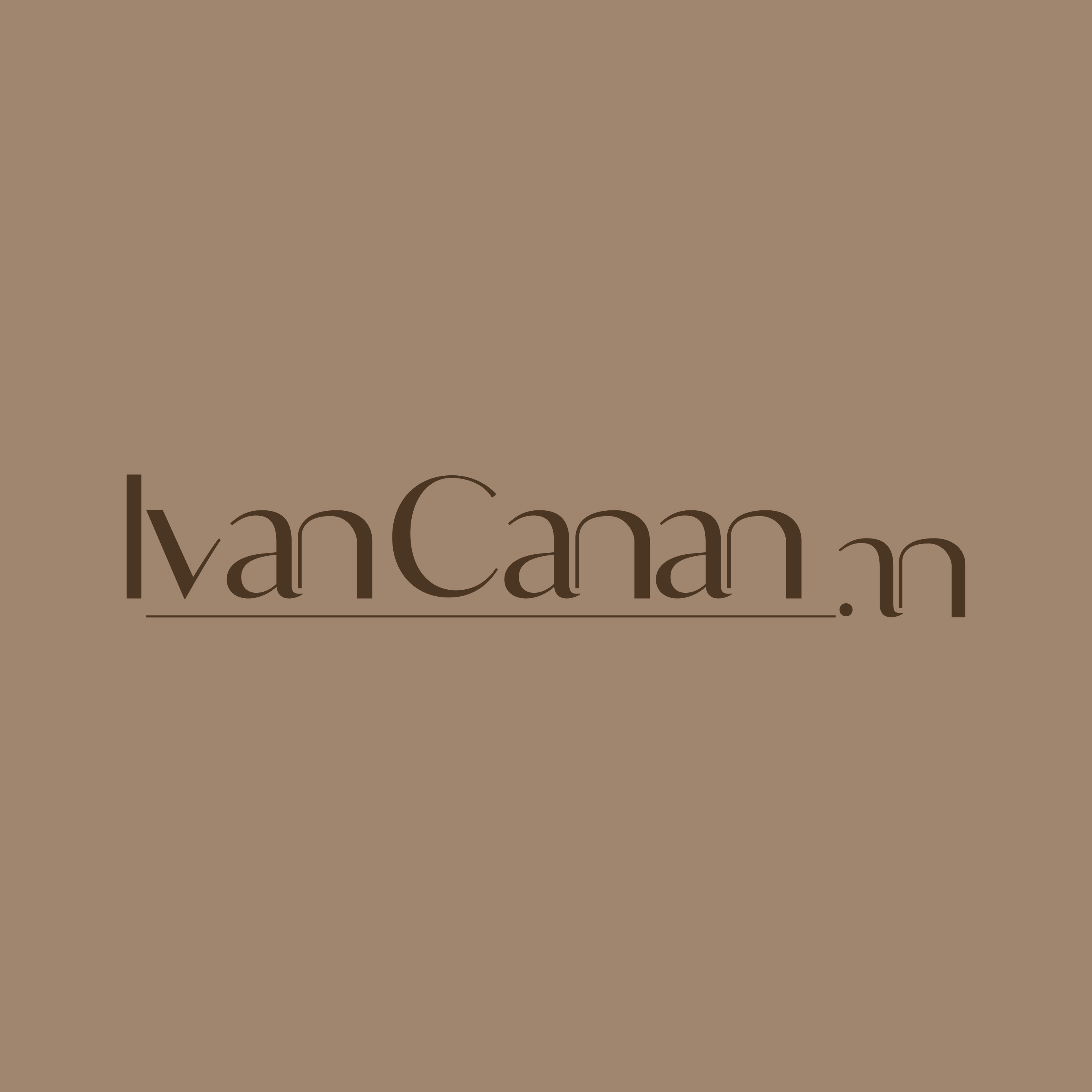
IvAN CanAN
This subtle repetition, almost imperceptible at first glance, became the foundation of the entire project.
Instead of searching for an external symbol to represent the writer, we chose to build the brand from his own identity.
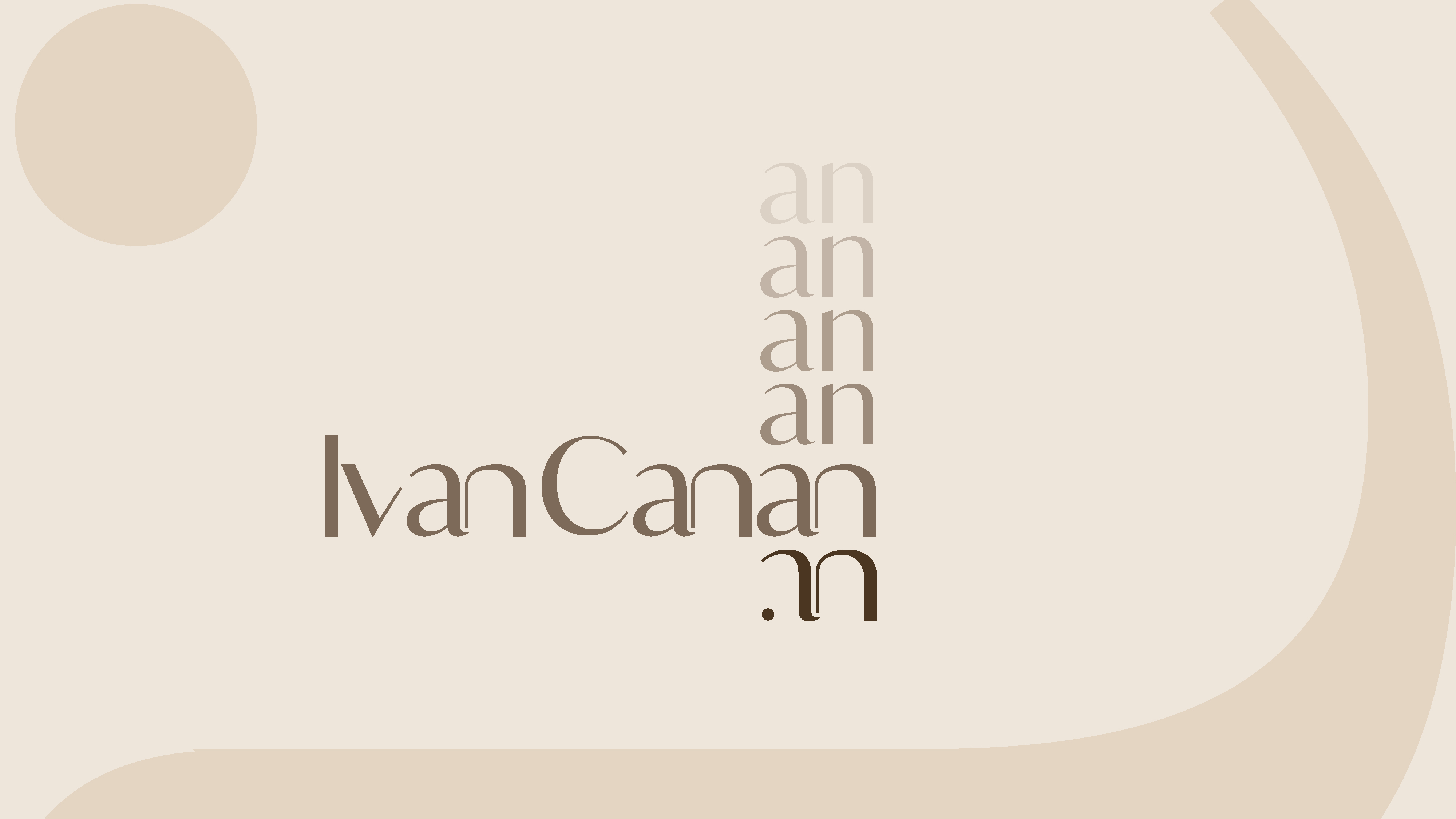
The monogram was created by stylizing this shared element between his first and last names, transforming two letters into a symbol that is simple, memorable, and entirely unique.
The result was a conceptual, understated, and deeply personal solution.
Exactly as it should be.
With the concept established, we sought a visual language capable of conveying the same quiet sophistication embodied by the brand.
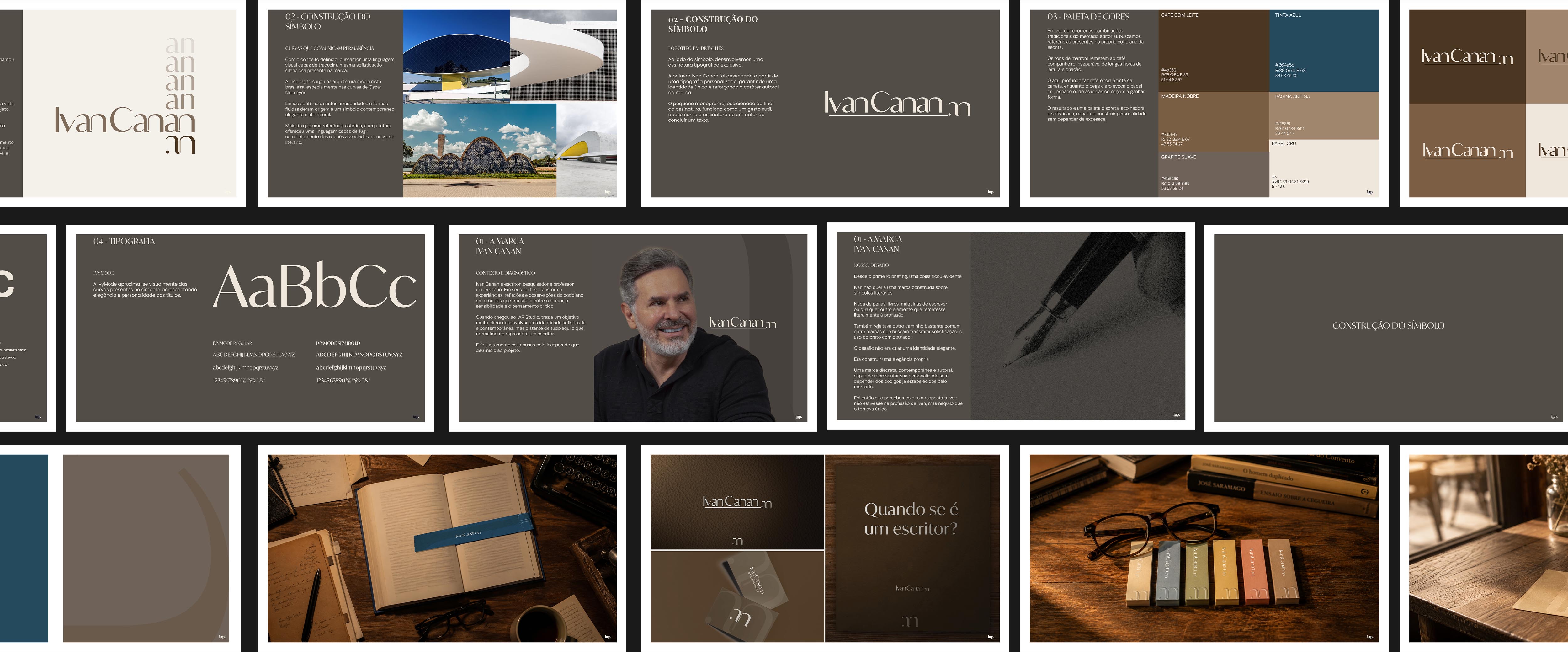
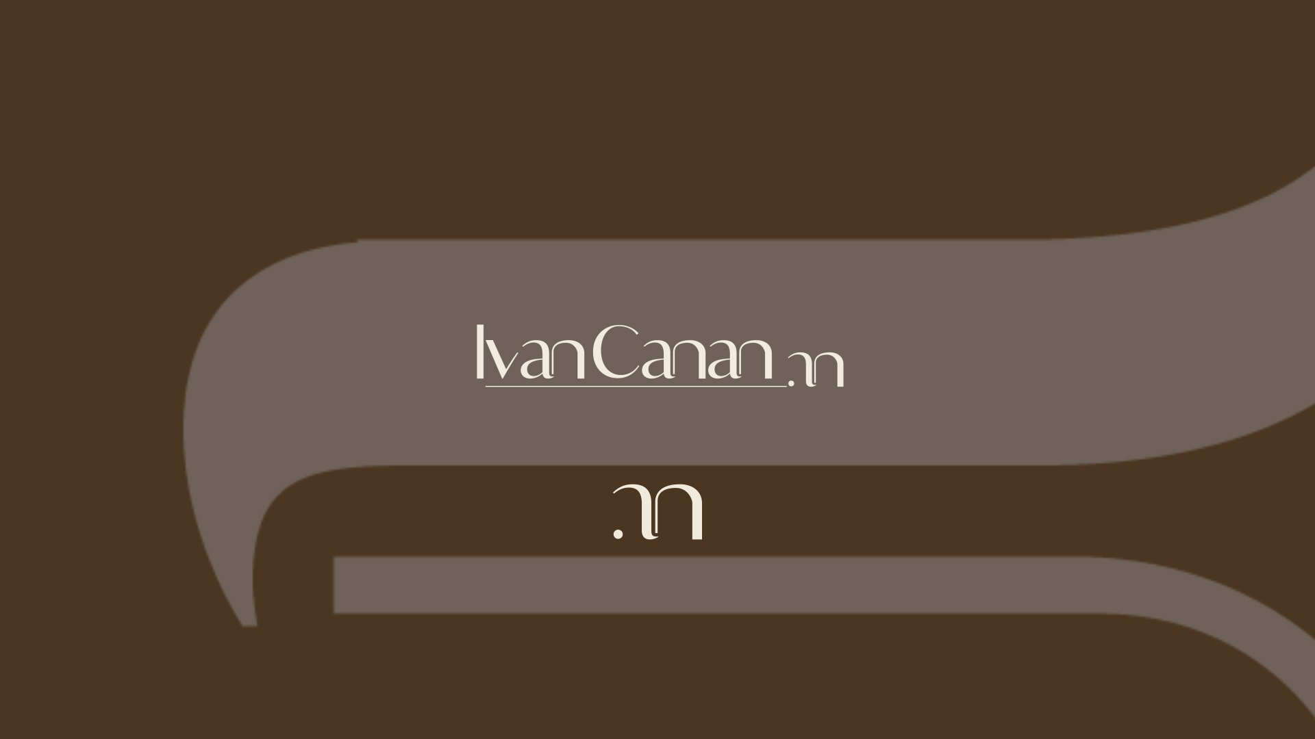
The inspiration came from Brazilian modernist architecture, particularly the iconic curves of Oscar Niemeyer. Continuous lines, rounded corners, and fluid forms shaped a symbol that feels contemporary, elegant, and timeless.
More than an aesthetic reference, architecture provided a visual language that completely avoided the clichés traditionally associated with the literary world.
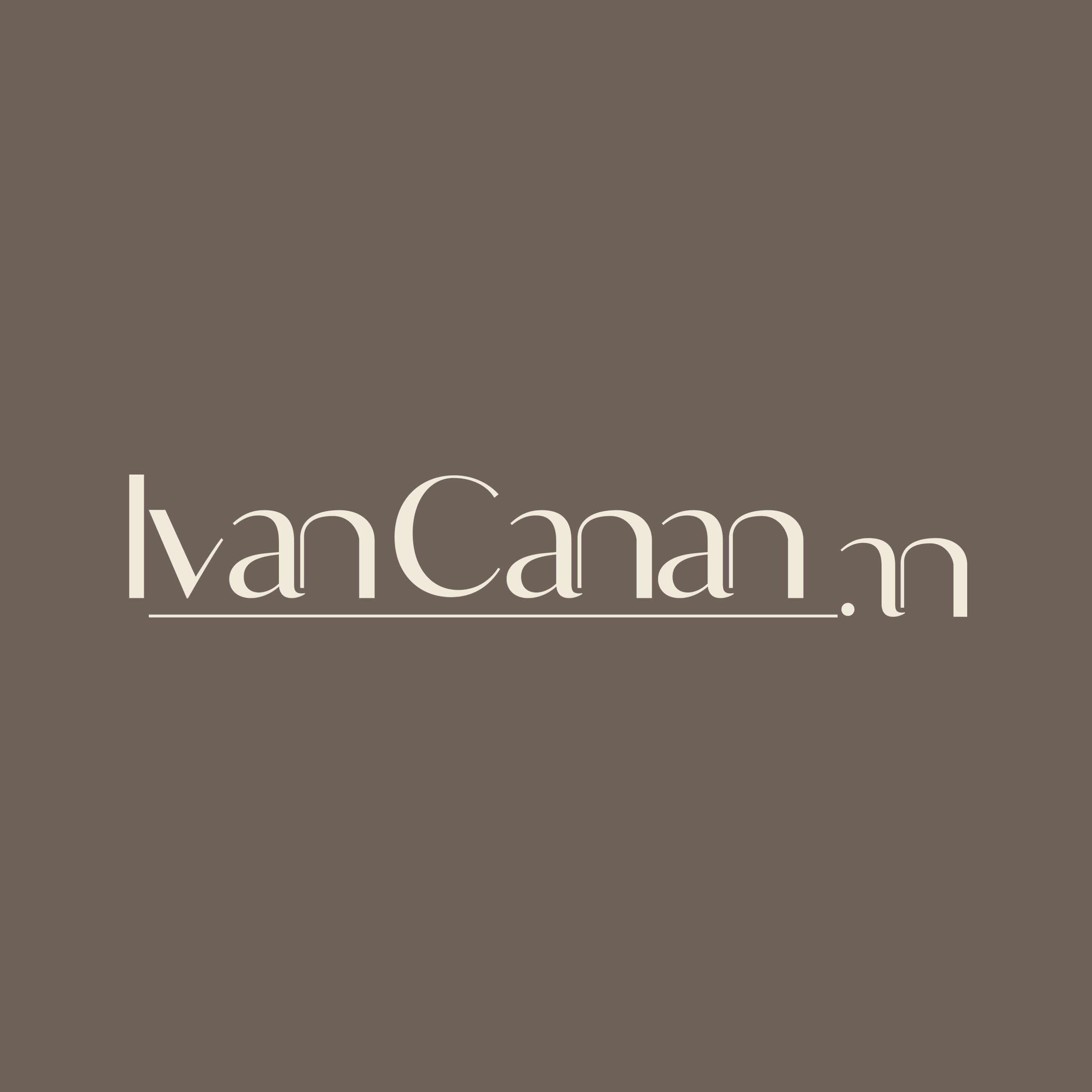
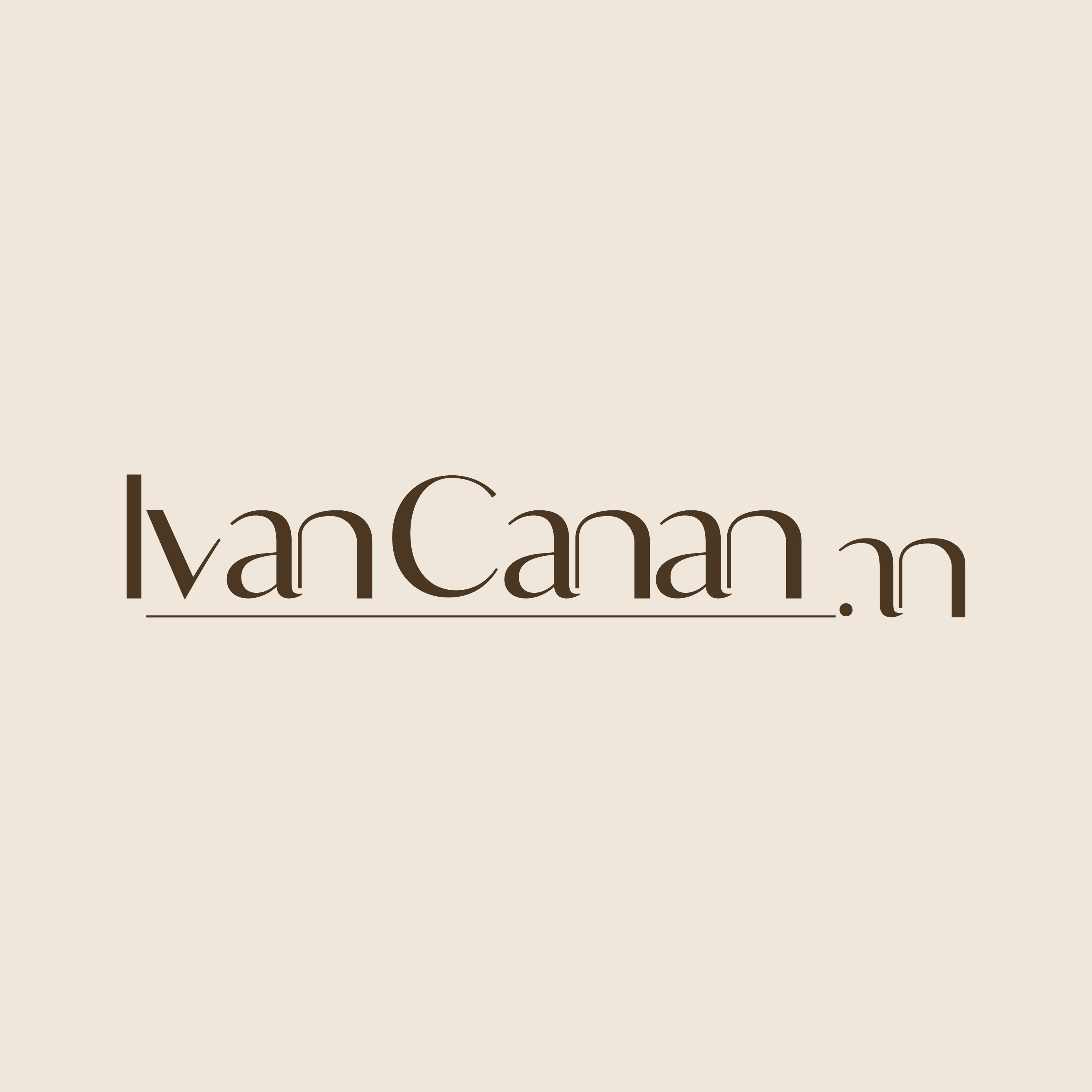
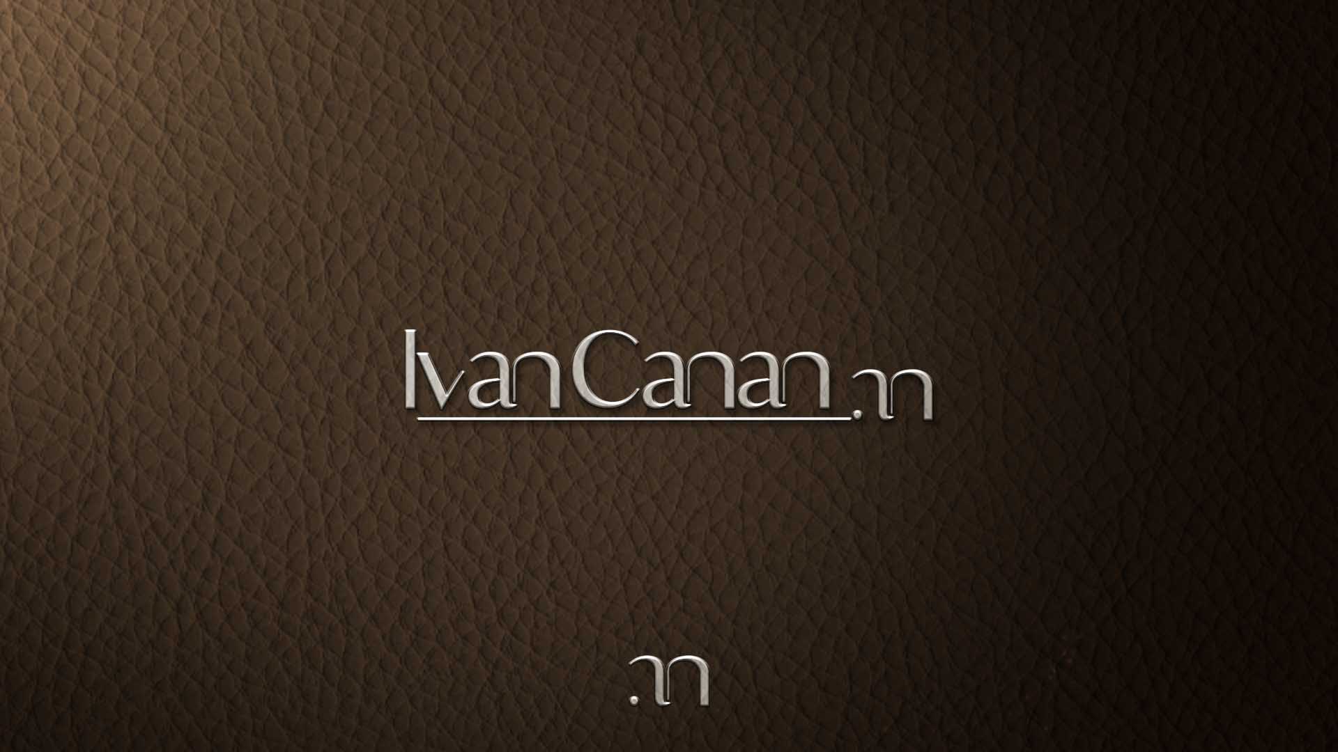
Alongside the symbol, we developed a custom wordmark.
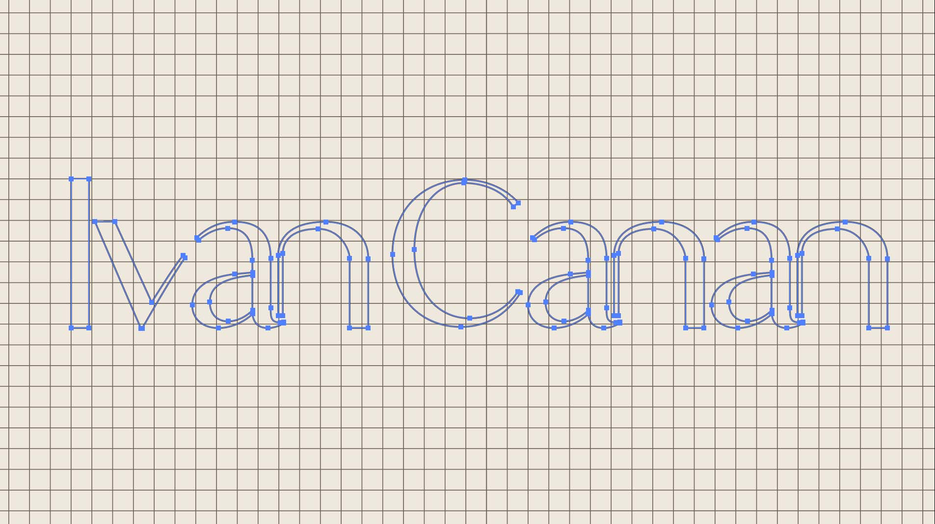
The name Ivan Canan was drawn using a bespoke typeface, creating a unique identity while reinforcing the author's distinctive character.
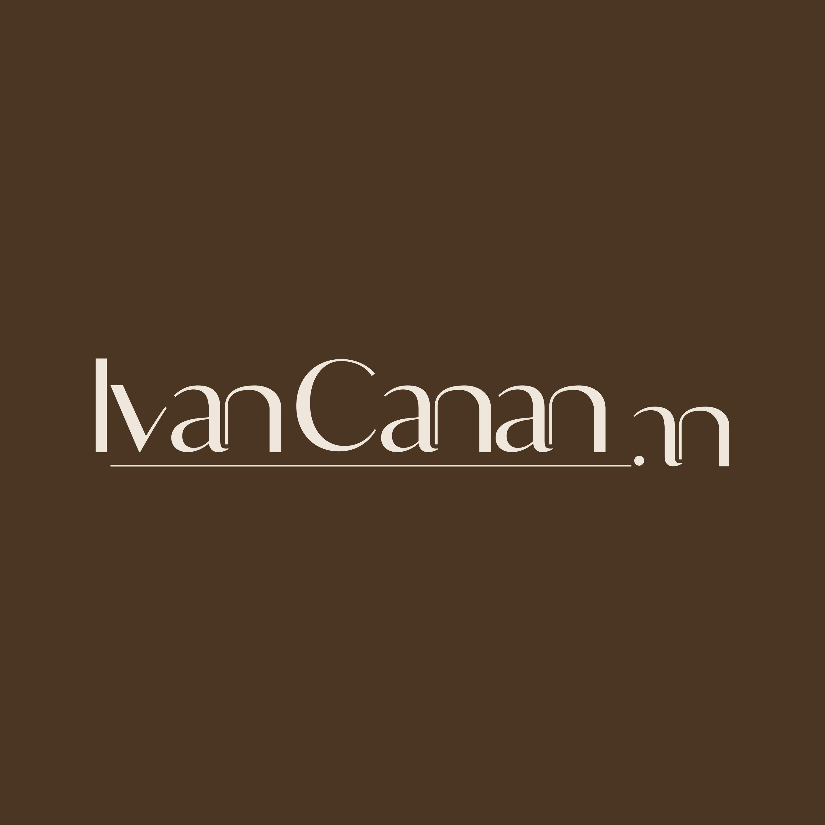
The small monogram, positioned at the end of the signature, acts as a subtle gesture, almost like an author's signature placed at the end of a written work.
Alongside the symbol, we developed an exclusive typographic signature.
The name Ivan Canan was crafted from a custom typeface, ensuring a distinctive identity while reinforcing the authorial character of the brand.
The small monogram, positioned at the end of the signature, acts as a subtle gesture, almost like an author's signature upon completing a text.
Elements can also be extracted and used independently, functioning as subtle accents that enrich the overall visual system.


Instead of relying on the traditional combinations of the publishing industry, we looked for references within the everyday world of writing itself.
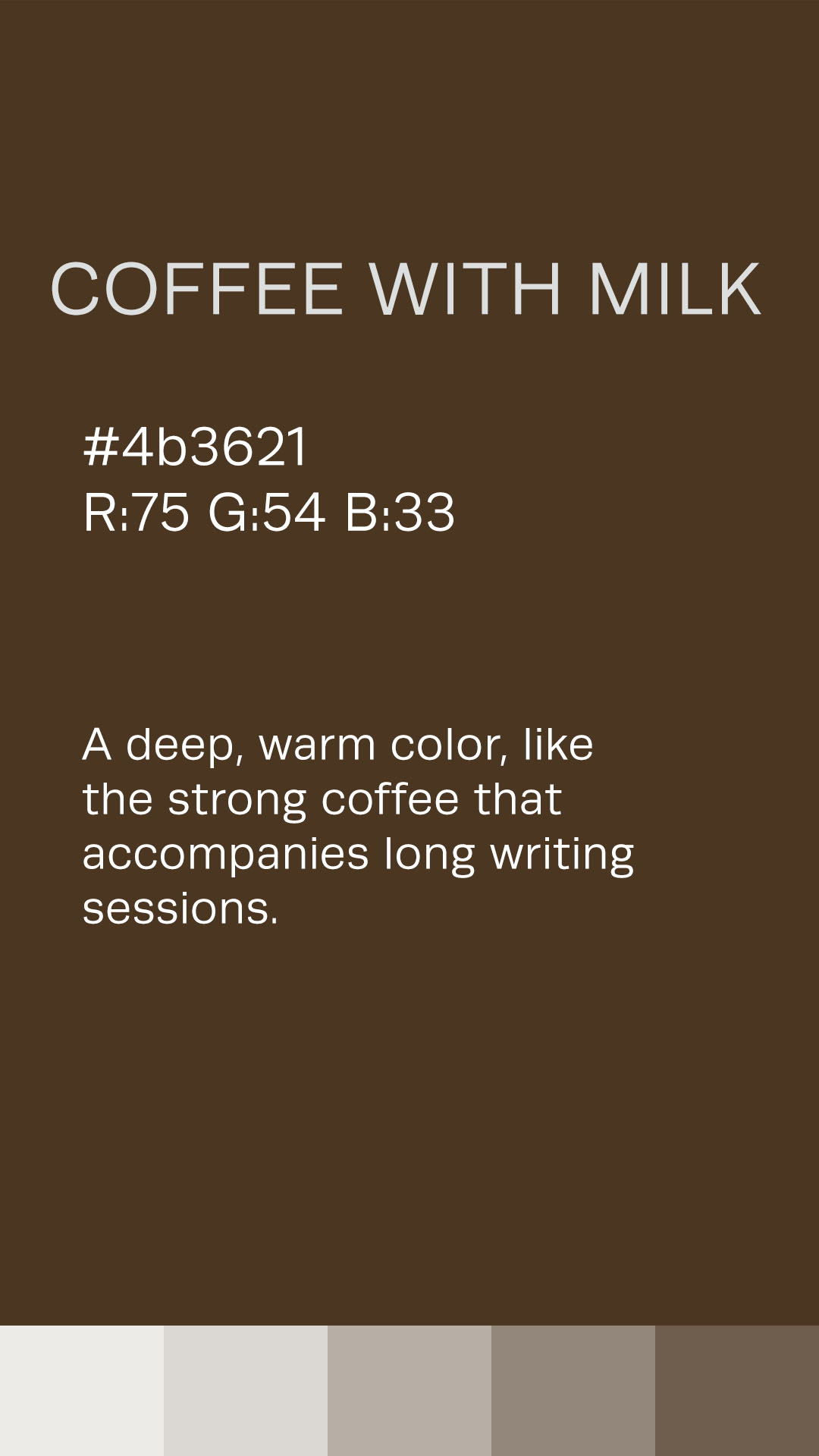
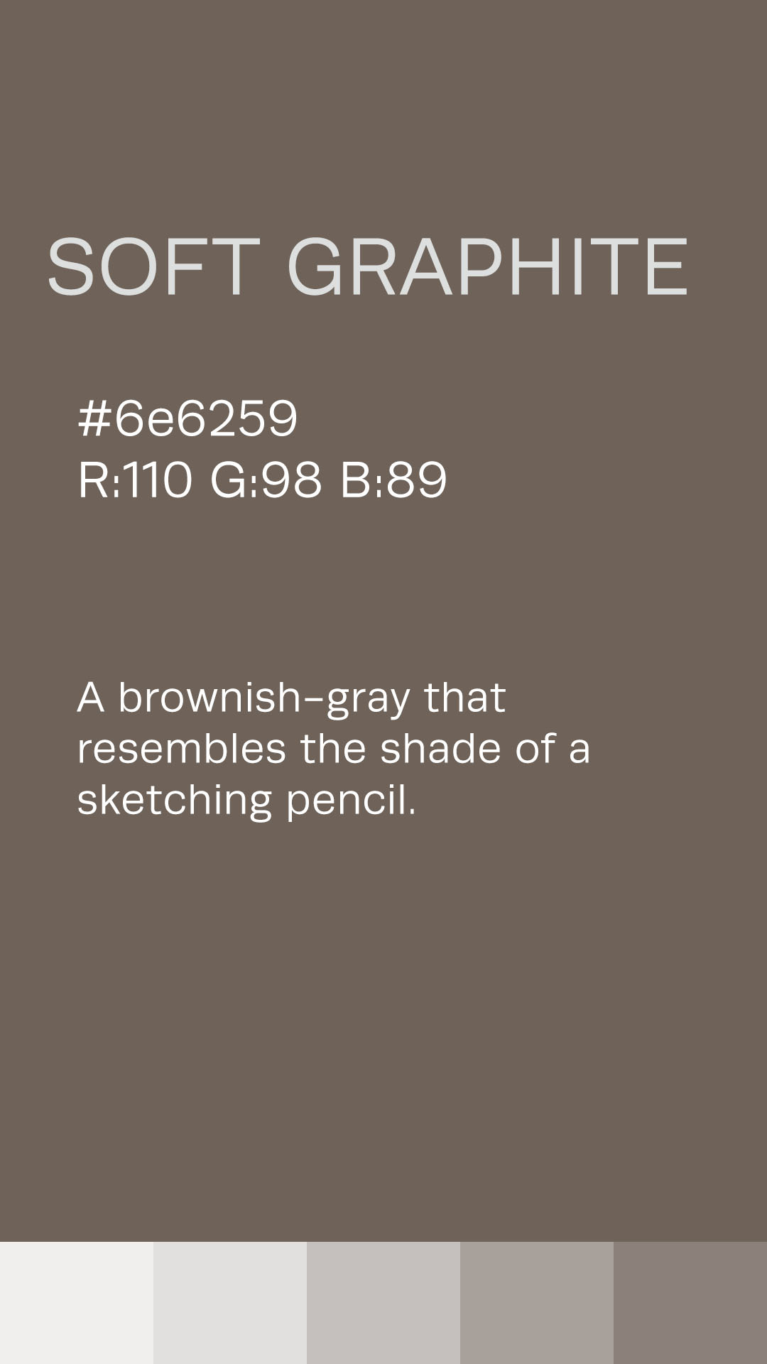
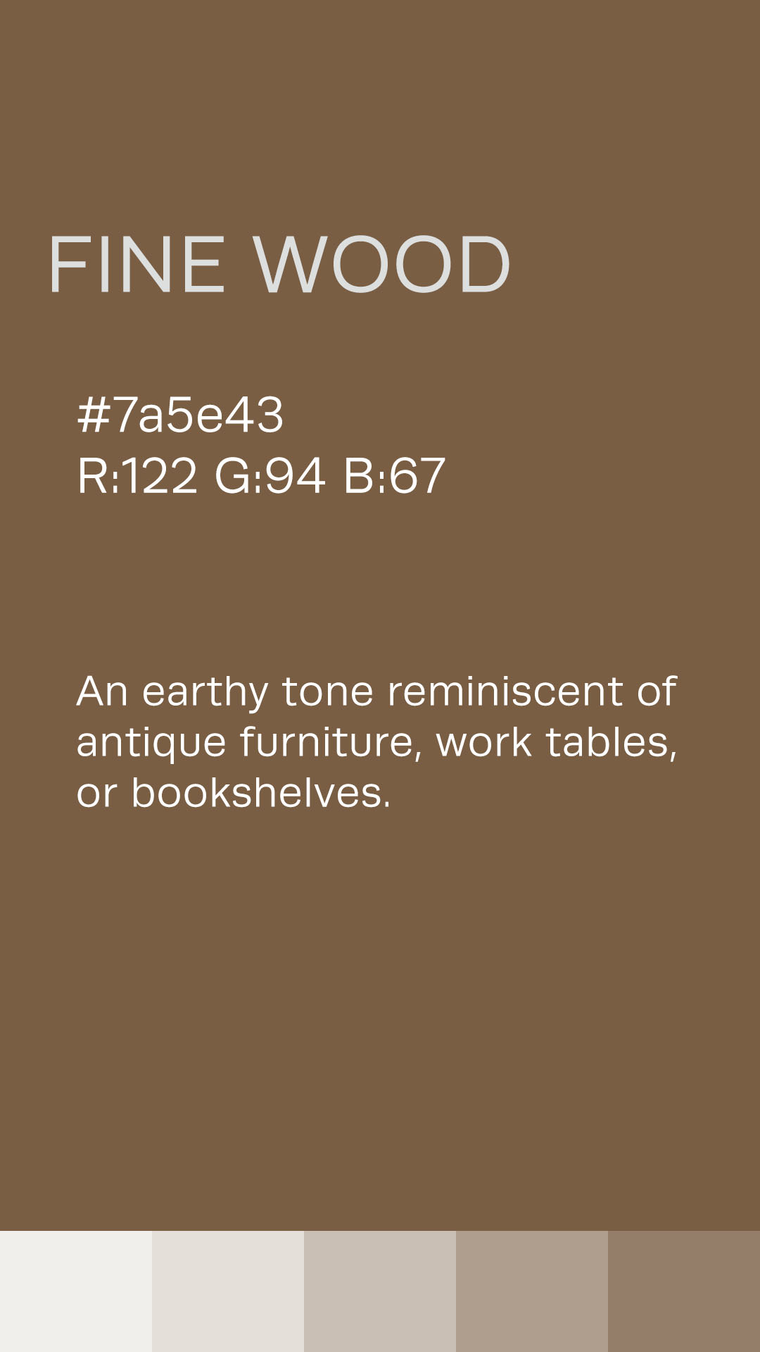
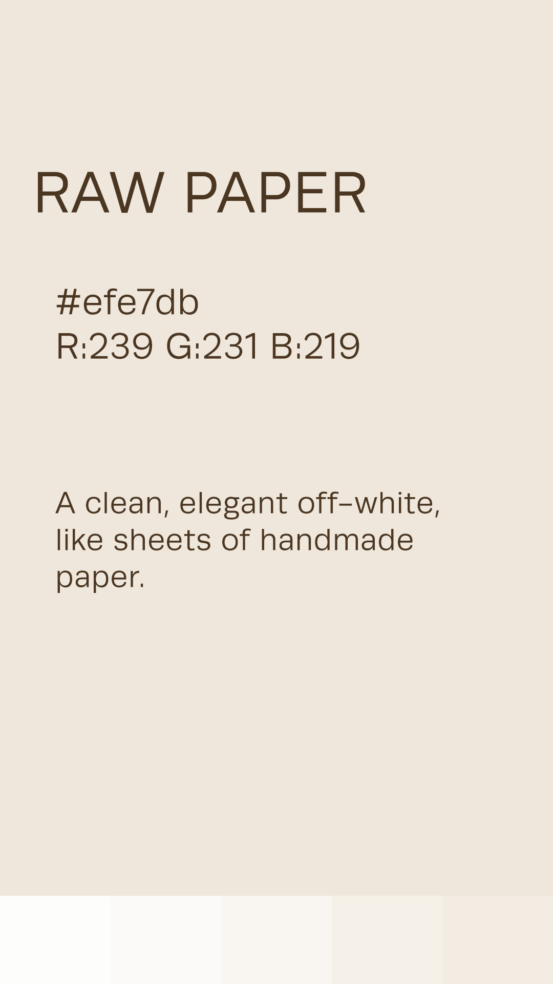
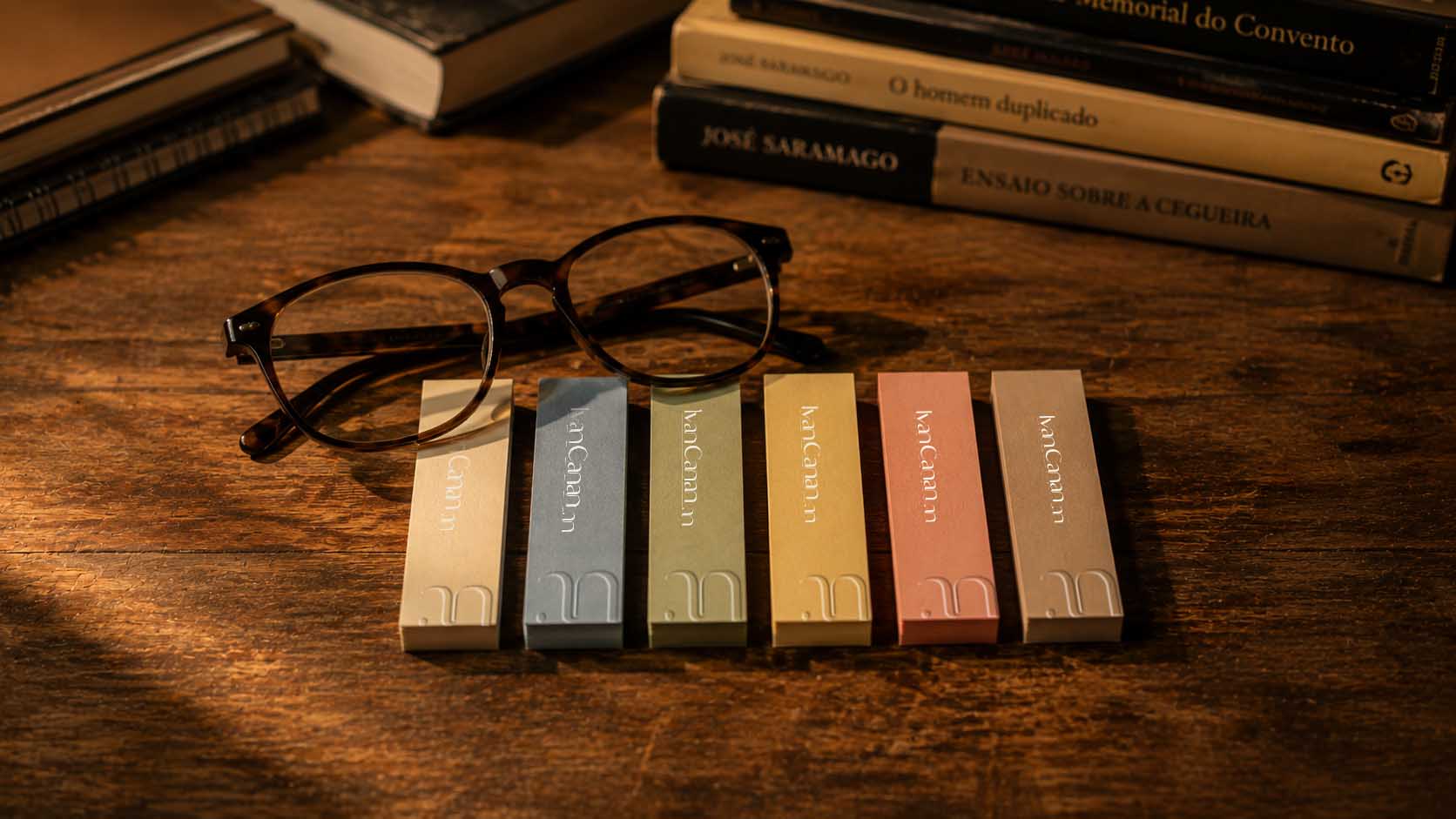
The shades of brown evoke coffee, an inseparable companion during long hours of reading and creation.
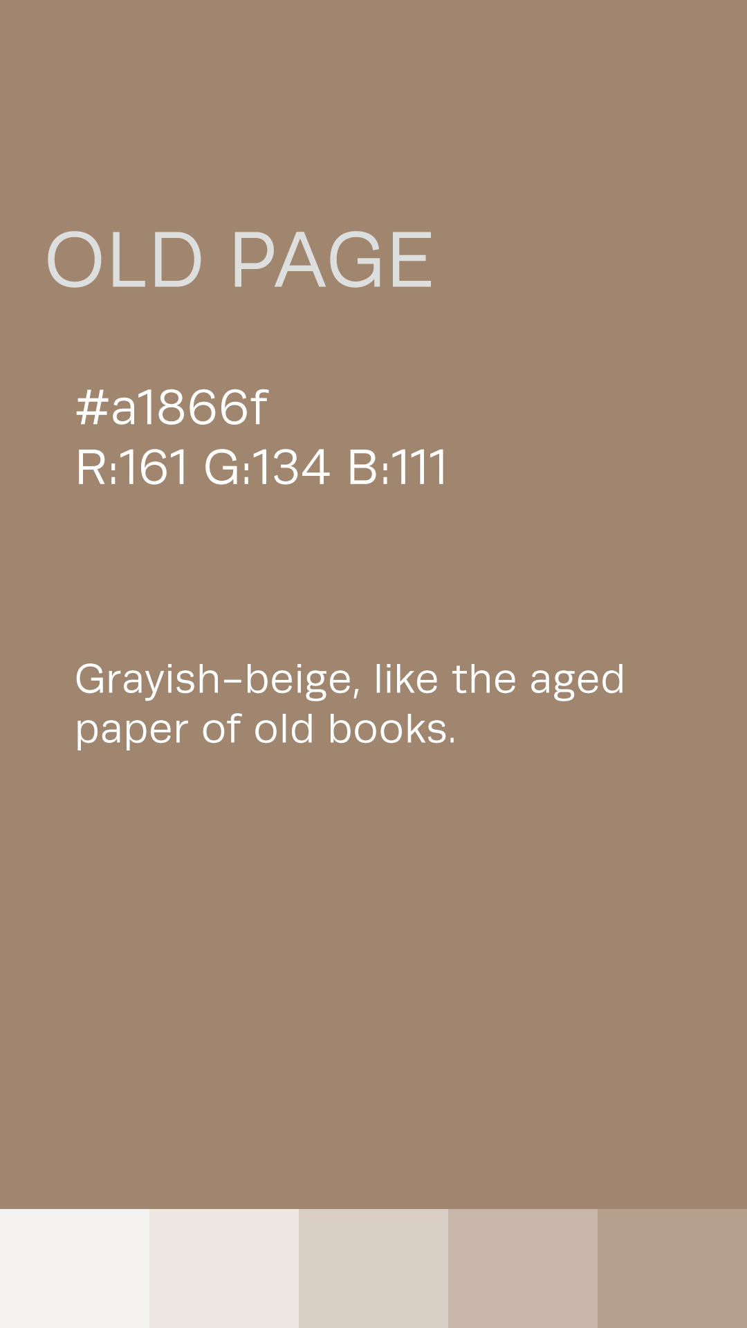
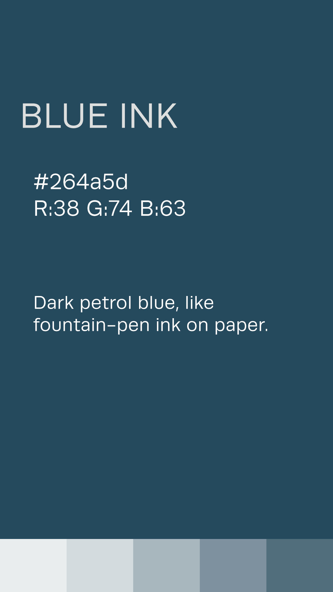
The deep blue references the ink of a pen, while the light beige recalls raw paper, the space where ideas begin to take shape.
The result is a discreet, welcoming, and sophisticated palette, capable of building personality without relying on excess.
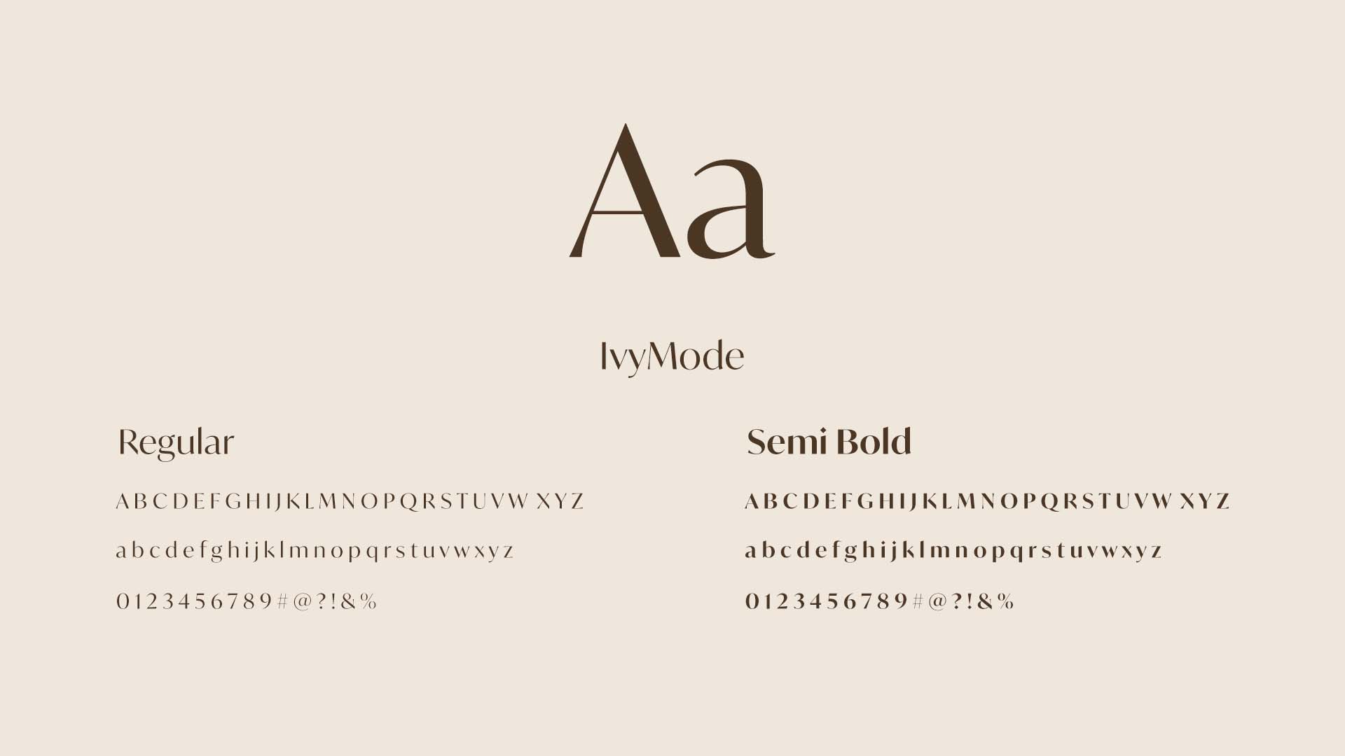
The primary typeface follows the same visual language established throughout the identity.
IvyMode echoes the graceful curves found in the symbol, adding elegance and character to headlines.
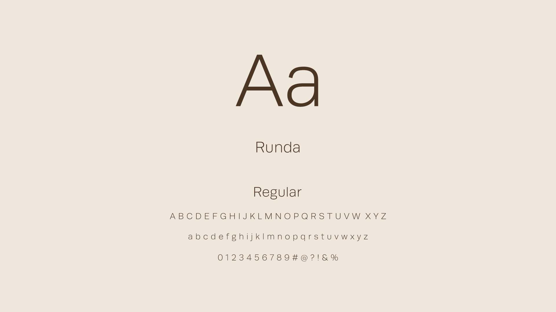
For body copy, we selected Runda, a clean sans-serif typeface that provides clarity, readability, and balance, creating a contemporary contrast to the sophistication of the primary typeface.
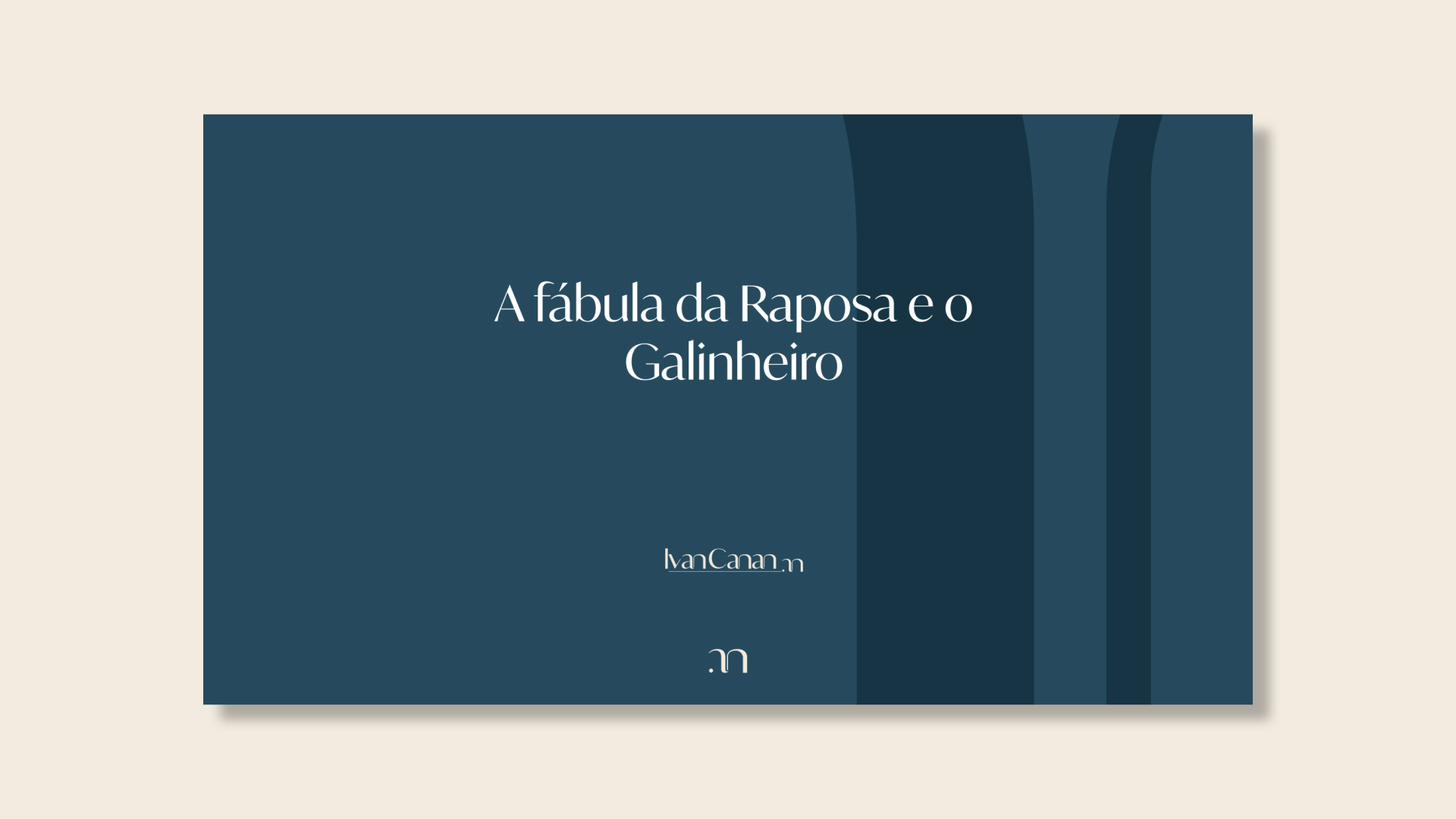
The monogram is the starting point for a visual language that goes beyond the brand signature.
Drawing from its curves and proportions, we developed graphic elements that can inhabit different spaces and contexts, subtly and consistently expanding the identity.
Rather than creating a decorative pattern or repeating the symbol literally, we explored its own forms as graphic material. Curves, crops, and enlargements allow the monogram to appear partially, extend beyond the boundaries of the composition, and create new visual possibilities without losing its origin.
The result is a discreet and flexible visual universe, designed to accompany the brand across different applications, from editorial to digital, while preserving the same elegance and personality embedded in its construction.

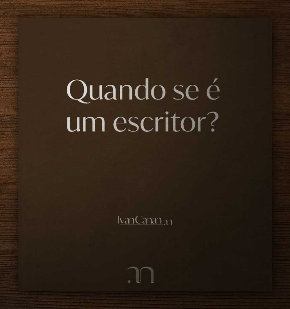



Ivan Canan's identity does not end with the logo.
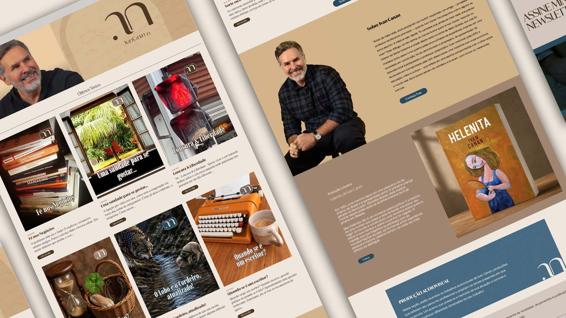
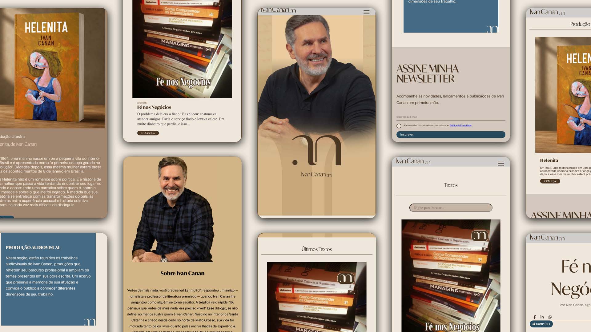
It continues through the way his texts are presented, the way readers move through each page, and the atmosphere created throughout the browsing experience.
For this reason, the website was conceived as a natural extension of the visual identity, preserving the same understated elegance that guided the entire project.
Rather than competing with the content, the design takes on a quiet supporting role. Typography, the color palette, and generous white space work together to guide the reading experience, allowing each chronicle to become the true protagonist.
More than a portfolio or a blog, the website was designed as a place for reading, a space where design and content coexist in perfect balance, highlighting what matters most: the stories.
This was our journey with Ivan Canan.
More than creating a visual identity, our work was a journey of research, discovery, and learning, drawing from different references to find a language capable of translating the personality and journey of a writer.
At IAP Studio, we believe that great brands are born when curiosity, knowledge, and sensitivity come together to shape an idea capable of expressing what makes each person unique.
Butiá is a handbag brand that embraces a new perspective on luxury: more understated, timeless, and connected to time. Inspired by the nature, landscapes,…
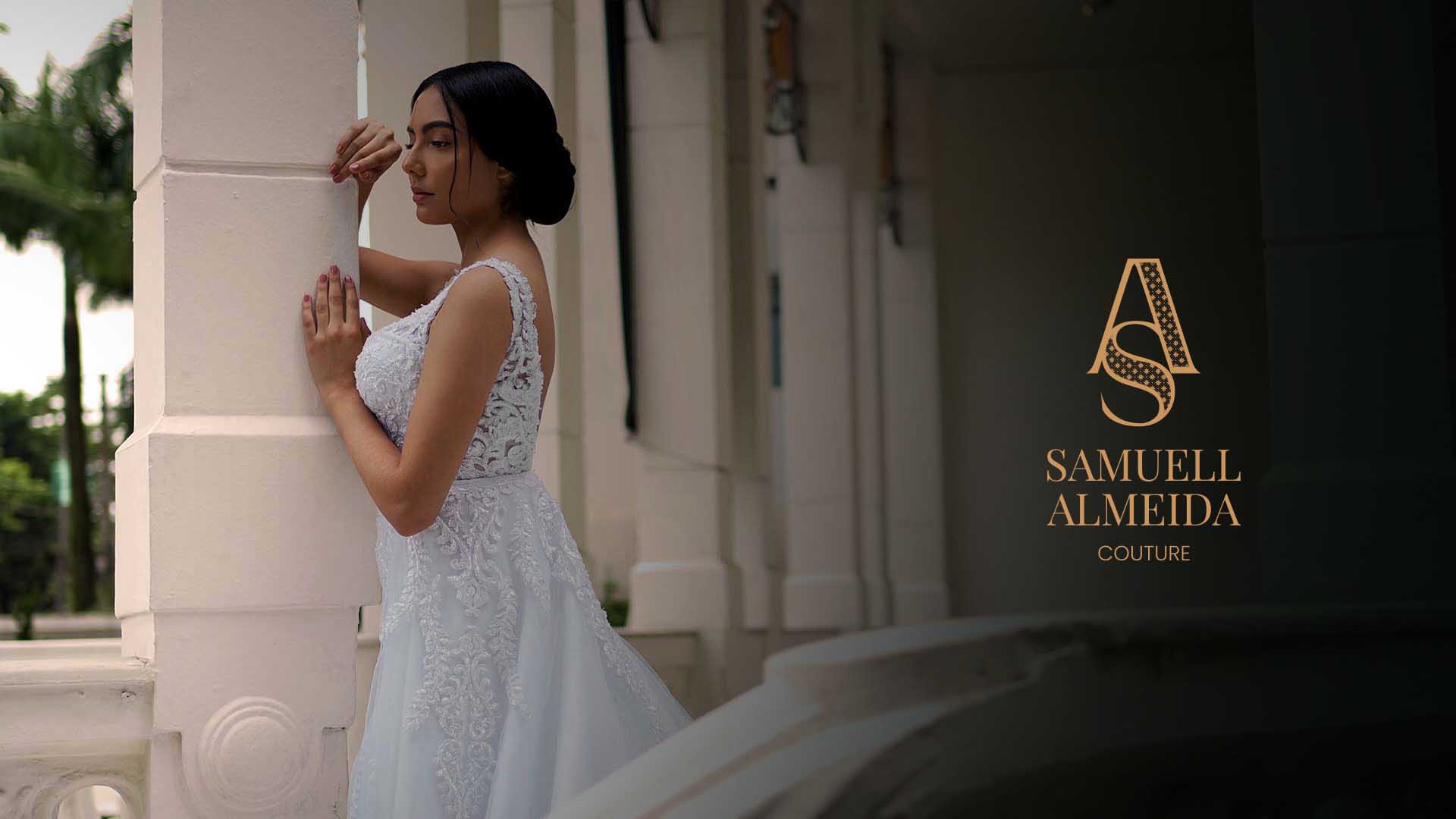
An identity that embodies the world of bespoke design, where every detail carries intention,and is revealed upon closer inspection
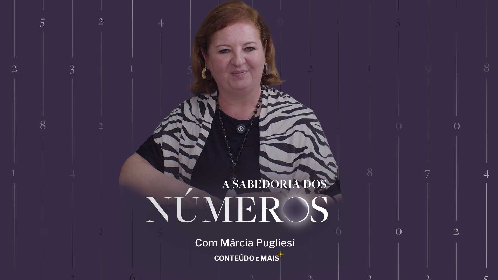
An identity that translates numerology as a language, present in life, in cycles, and in the universe.