
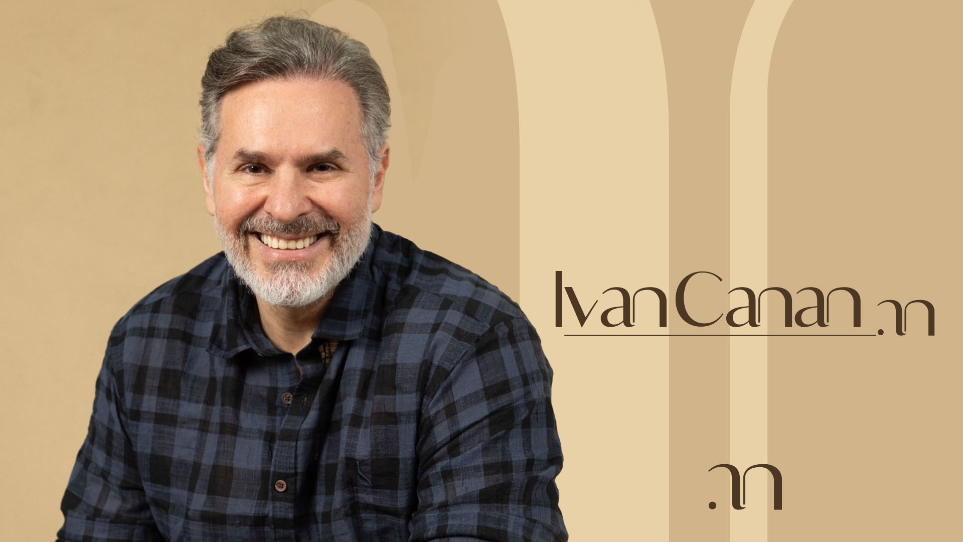
Ivan Canan
Ivan Canan's identity stems from his own signature to create a visual system based on rhythm, repetition, and modernist curves.
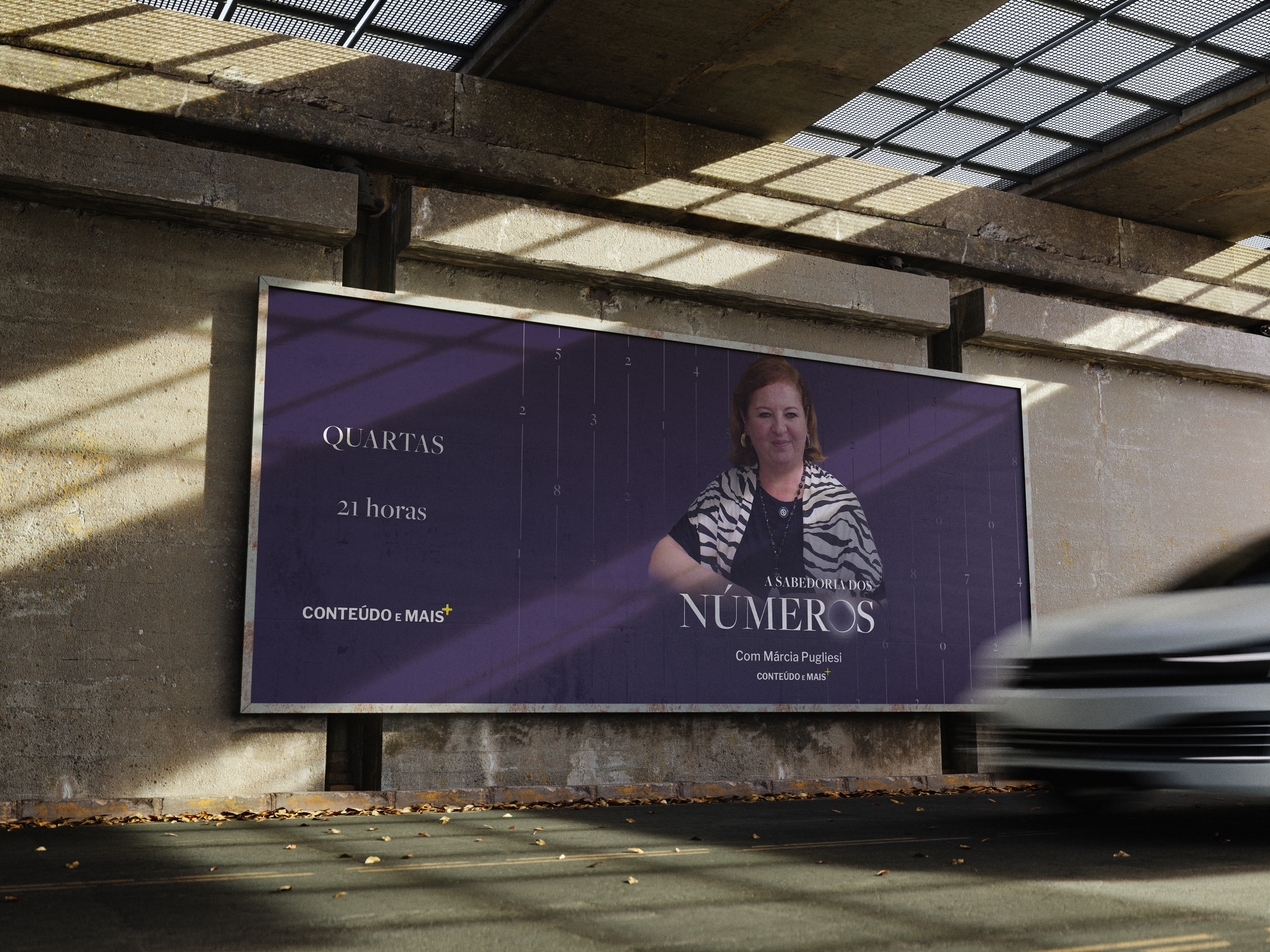
Sabedoria dos Números is a weekly program on the Conteúdo e Mais platform, hosted by numerologist Márcia Pugliesi. The program presents numerology from a more rational perspective, approaching it as a science rather than fortune-telling.
Its purpose is to demystify numerology and show how an understanding of numbers can be applied in practical ways to everyday life.
The challenge was to create an identity that conveyed the seriousness of the program without losing the symbolic universe associated with numerology.
We did not want to rely on the most obvious visual codes of the esoteric world, but completely distancing the identity from that territory would not make sense either. The project needed to find a balance between science, mystery and symbolism.
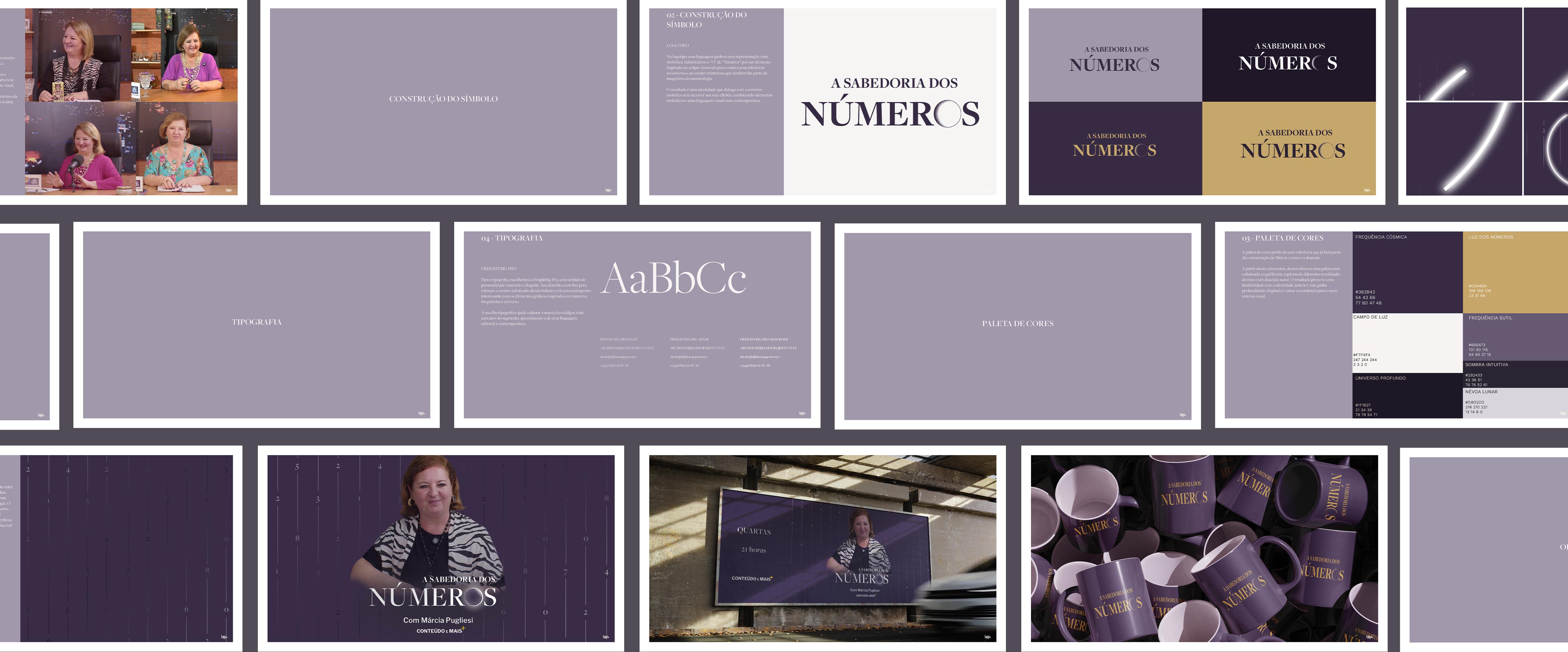
From the very essence of numerology, we found the central concept for the identity: bringing numbers into the brand itself.
In numerology, numbers and letters are associated with frequencies and influences that are believed to be part of our lives. This idea of frequency became one of the main references for building the visual system.
Numbers therefore became part of the different elements of the identity, accompanied by lines and patterns that evoke waves and frequencies.
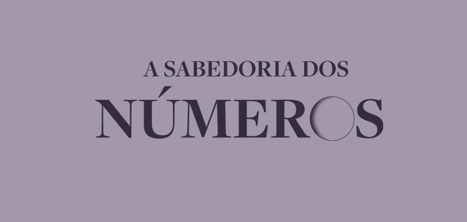
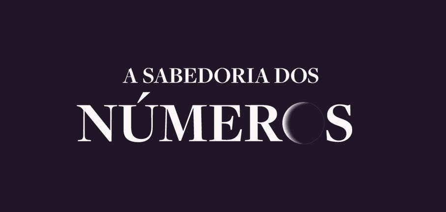
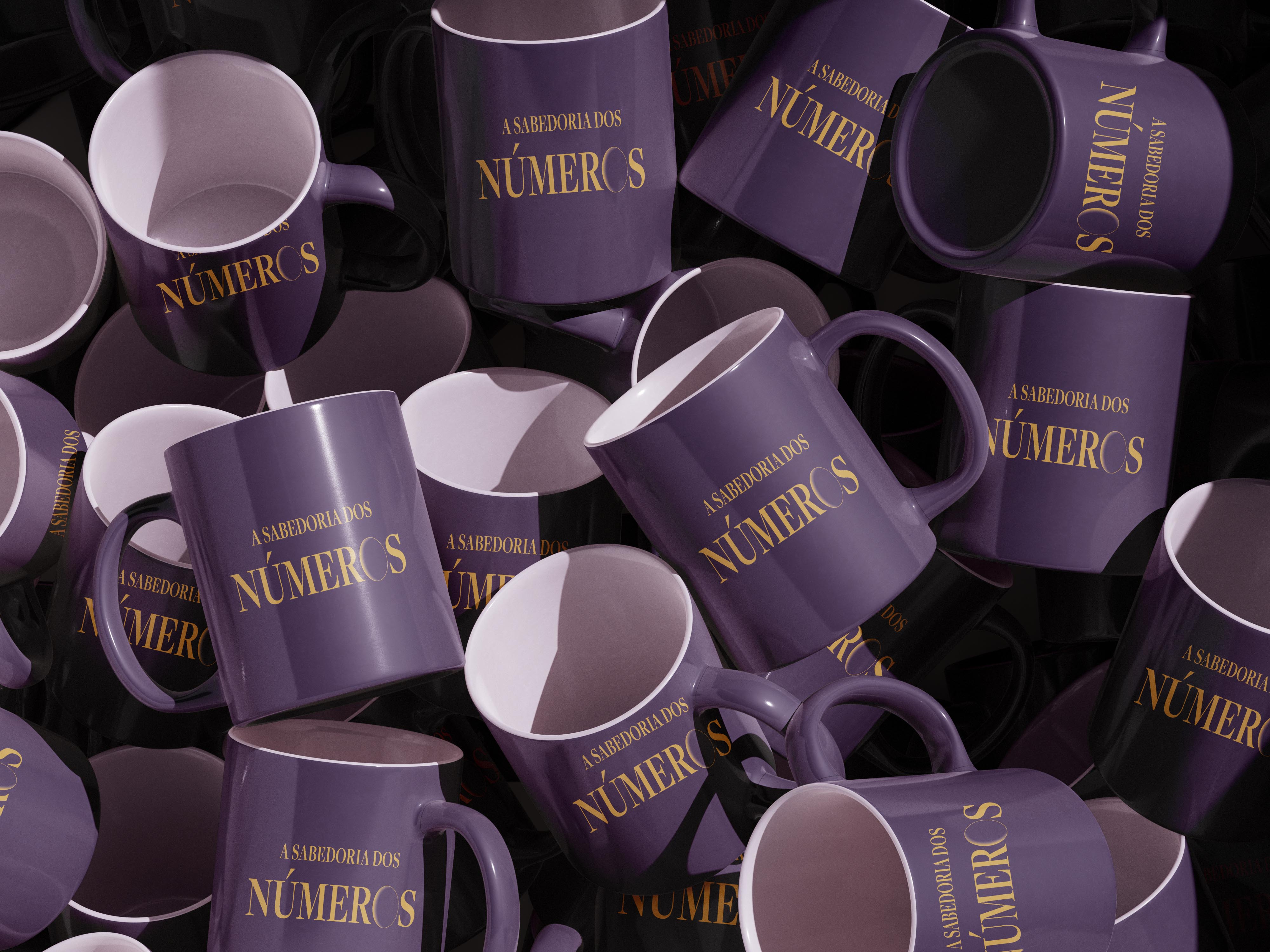
In the logo, this language takes on a more symbolic form. We replaced the “O” in “Números” with an element inspired by an eclipse, bringing a reference to the universe and to the sense of mystery that is also part of the imagery surrounding numerology.
The result is an identity that engages with the esoteric universe without relying on its clichés, combining symbolic elements with a more contemporary visual language.
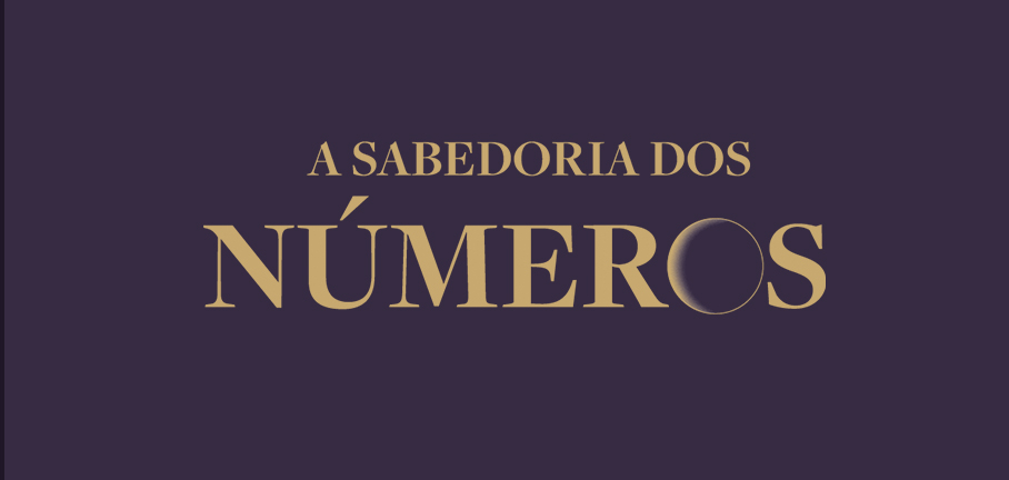
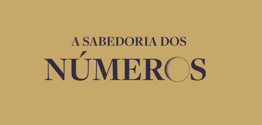
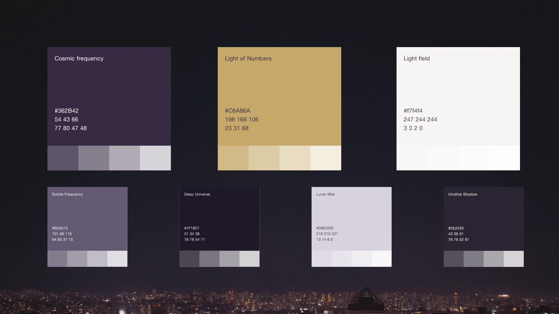
The color palette started with a reference that was already part of Márcia’s visual communication: purple and gold.
From these elements, we developed a more sophisticated and balanced palette, exploring different shades of purple alongside a soft gold. The result preserves a sense of familiarity with the previous identity while adding depth, elegance and greater consistency to the new visual system.
For the typography, we chose FreightBig Pro, a serif typeface with a distinctive and elegant character. Its design reinforces the sophisticated quality of the identity while creating an interesting counterpoint to the graphic elements inspired by numbers, frequencies and the universe.
The typographic choice helps move the brand away from the more caricatured visual codes of the category, bringing it closer to an editorial and contemporary language.
We also created a graphic pattern based on the combination of numbers and lines. When arranged along these lines, the numbers form sequences that visually represent the frequencies and influences attributed to them in numerology.
The resource can appear either as a static element or come to life through motion, creating different compositions throughout the identity. It is used both in the program’s opening animation and across its graphic materials, becoming a recurring and recognizable element of the brand.
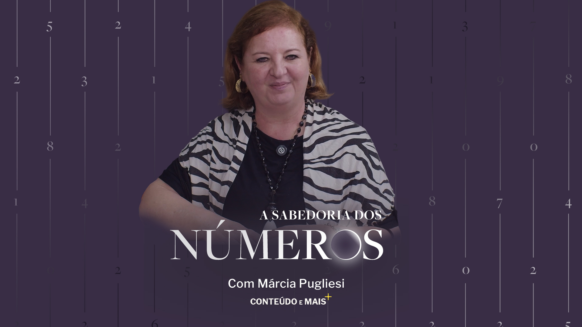
To launch Sabedoria dos Números on the Conteúdo e Mais platform, we also developed a trailer introducing the new program. The piece uses the visual language created for the brand to build anticipation and present the new show to its audience.
This was our journey with Sabedoria dos Números.
More than creating an identity for a numerology program, our work was about finding a language capable of balancing knowledge and symbolism, preserving the essence of the project without relying on the clichés of the esoteric universe.
At IAP Studio, we believe strong brands do not have to choose between what they are and what they can become. They need to find the best way to translate their essence into a language of their own.
Ivan Canan's identity stems from his own signature to create a visual system based on rhythm, repetition, and modernist curves.
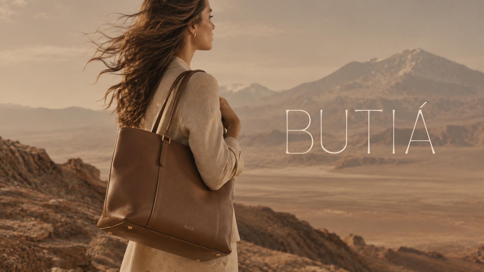
Butiá is a handbag brand that embraces a new perspective on luxury: more understated, timeless, and connected to time. Inspired by the nature, landscapes,…
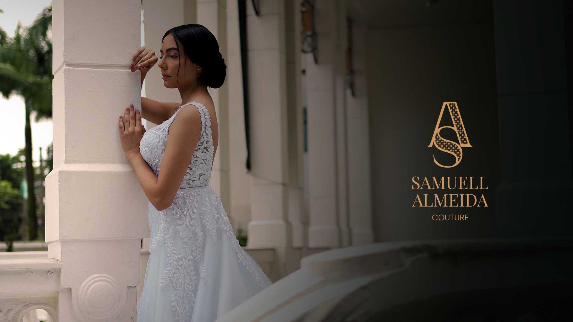
An identity that embodies the world of bespoke design, where every detail carries intention,and is revealed upon closer inspection