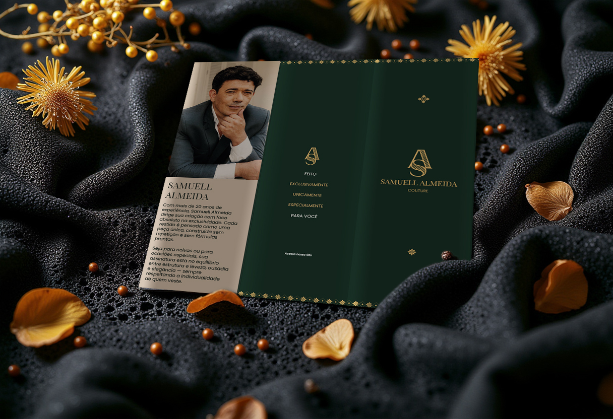
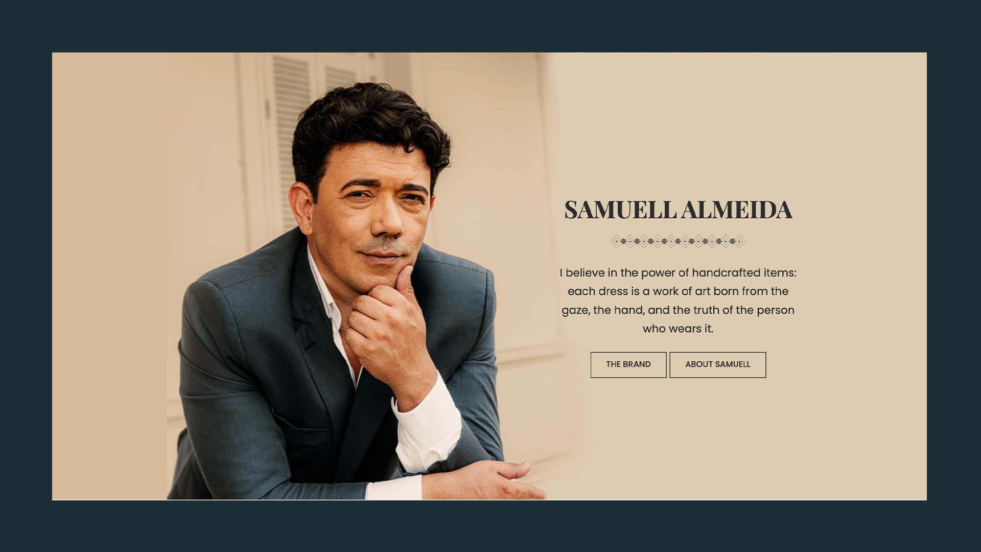
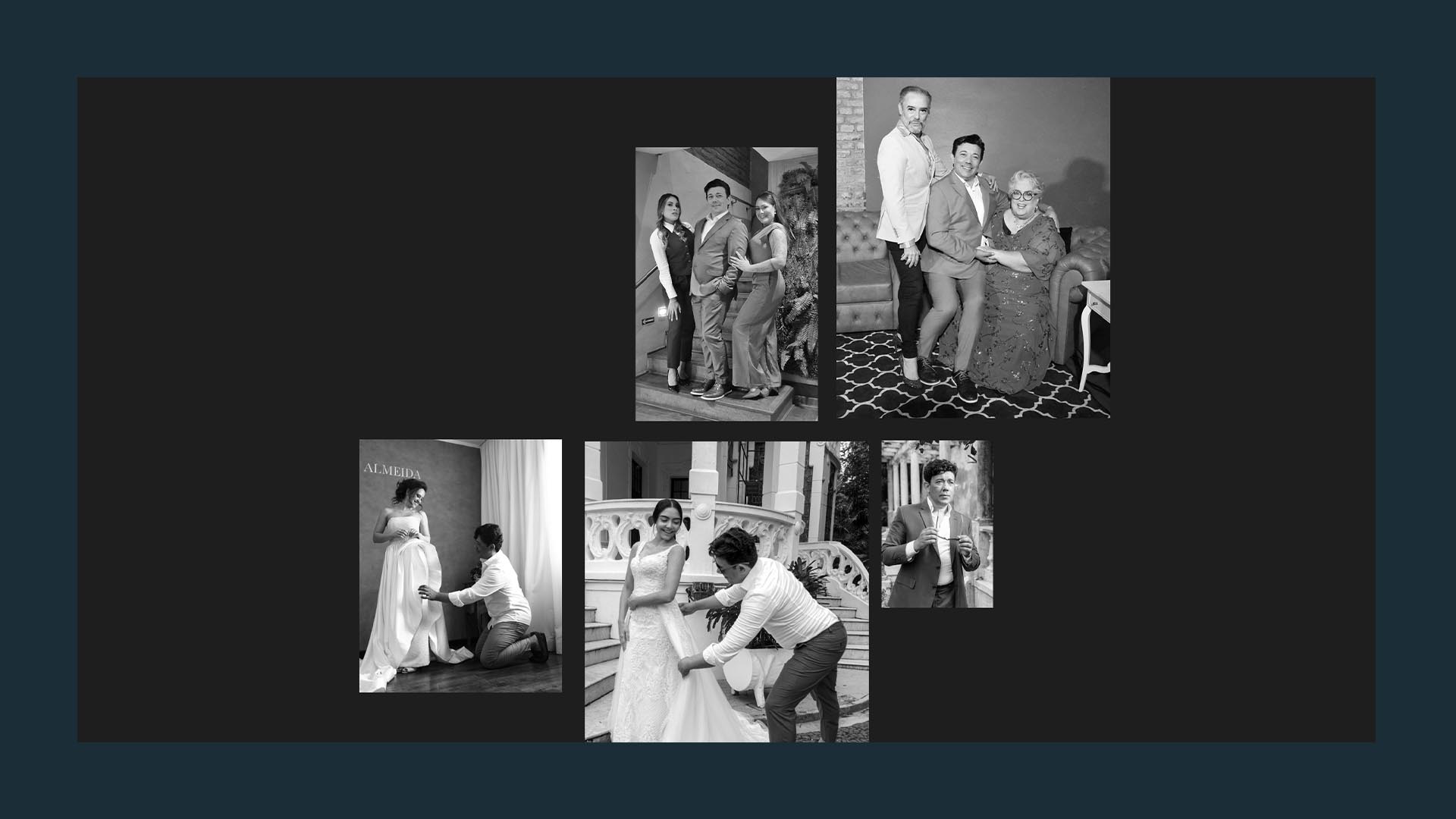
Samuell Almeida is a Brazilian designer specializing in bespoke wedding and Evening gown. His work has always been deeply connected to craftsmanship, attention to detail, and original creation.
But, until our arrival, this essence was stifled by a business model that didn’t reflect his true calling.
And that’s exactly where this story begins.
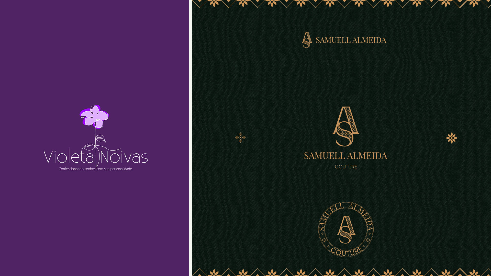
When we met Samuell and his partner, the company was still called Violeta Noivas and aimed to operate as a dress factory, producing pieces on a large scale to supply retailers.
The scenario was challenging.
There was no structured business plan.
The operation lacked the scale and structure to sustain this model.
And, above all, Samuell was radically against this idea.
His desire was always different: to create original, exclusive, handcrafted pieces, without copies, without mass production.
The conflict between creative vision and business model hindered the company’s growth—and jeopardized the very future of the business.
It was at this point that IAP Studio entered.
Our first move wasn’t to talk about branding, logos, or websites.
It was to listen, investigate, provoke, and rebuild the business strategy.
Because strategy isn’t about limiting creation. It’s about liberating it.
After a deep immersion, it became clear:
Samuell’s vocation wasn’t industrial. It was artistic, original, and handcrafted.
The strategic decision was decisive:
Violeta Noivas would cease to exist to give way to Samuell Almeida Couture,
an original haute couture atelier specializing in bespoke wedding and party dresses.
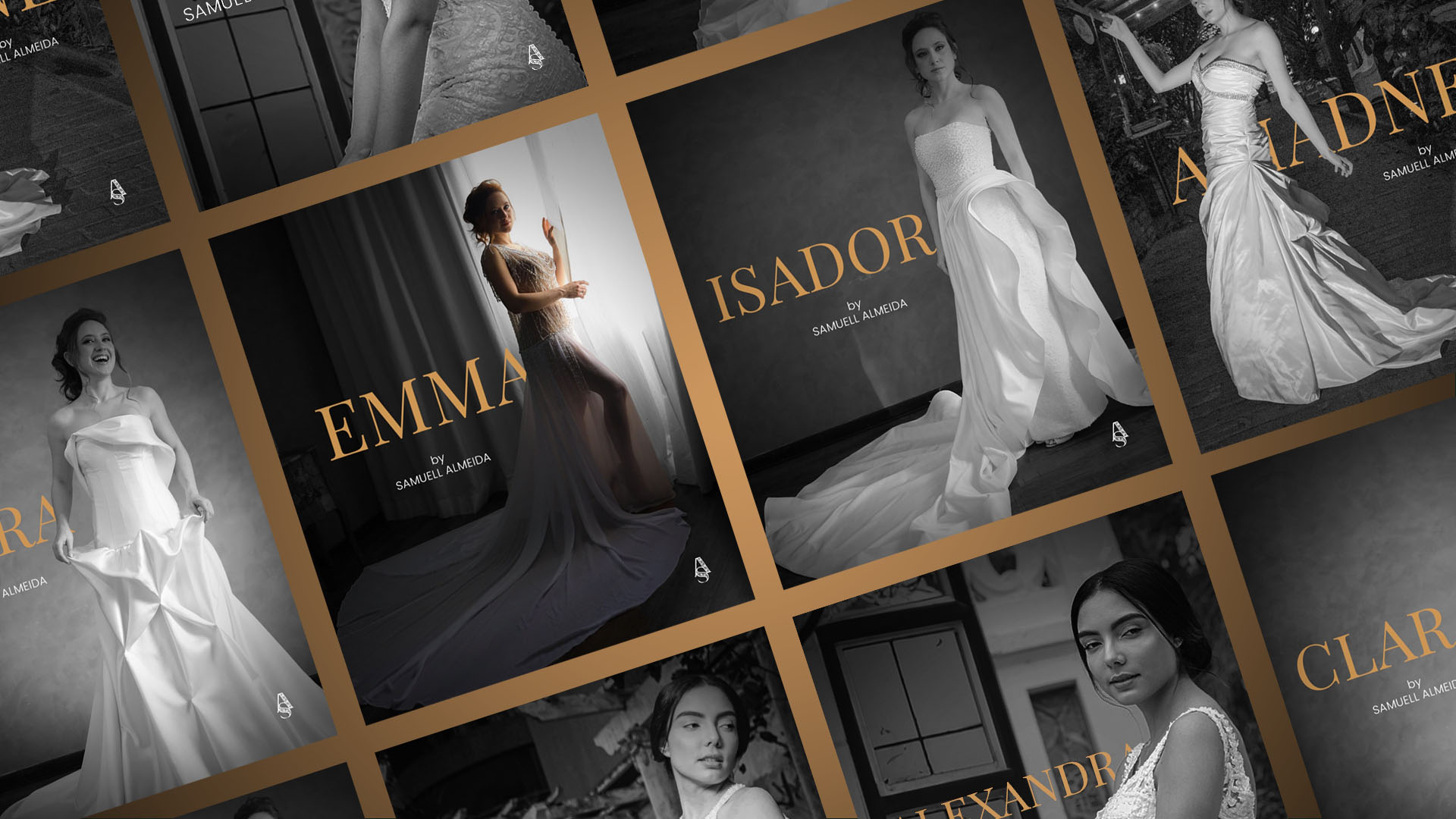
During the diagnostic phase, we identified a decisive insight: even Samuell’s ready-made dresses were one-of-a-kind pieces, never reproduced.
That was the brand’s DNA.
We turned it into strategy.
We created a system built on scarcity and desire:
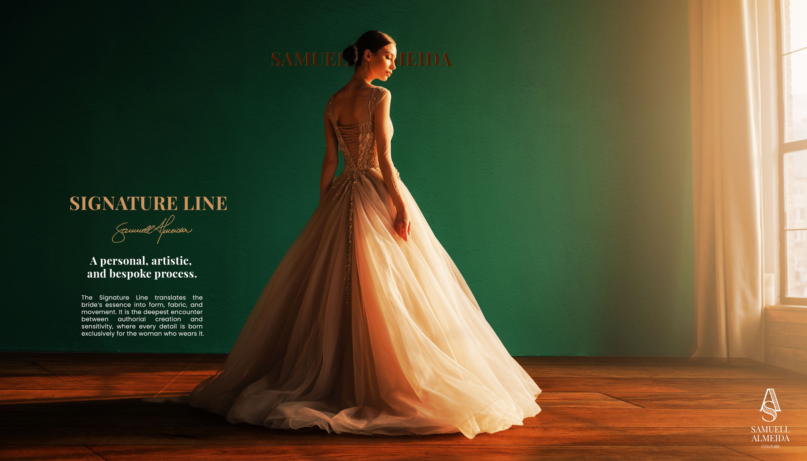
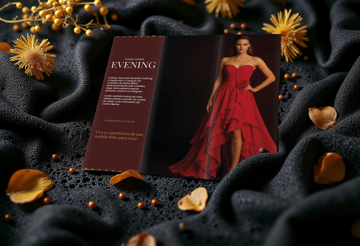
In parallel, we structured the Signature line — an ultra-exclusive service in which each dress is created from scratch, from concept to final stitch, designed for a single bride.
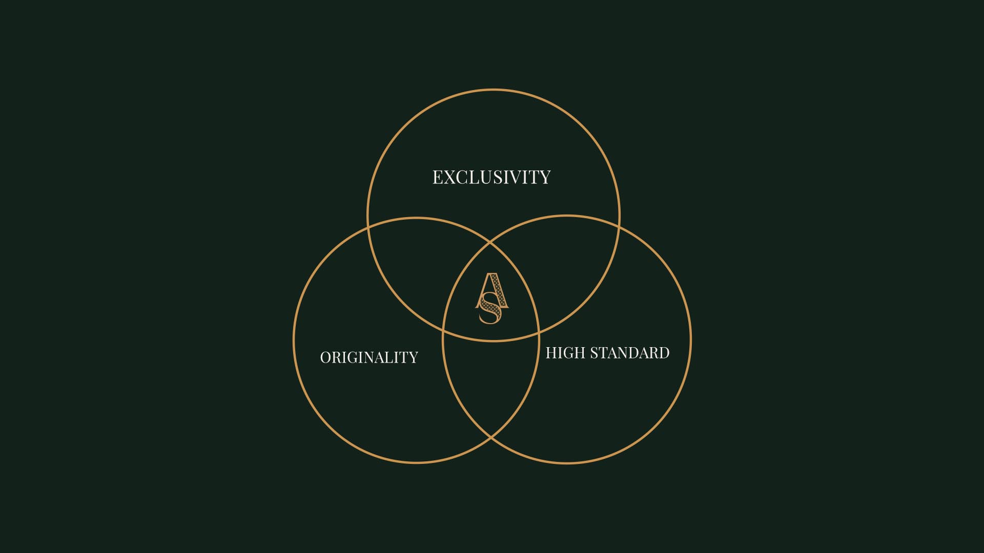
The result is a business model that combines:
scarcity,
desire,
exclusivity,
recurrence,
and a constant sense of renewal.
More than unlocking the company’s growth, this strategy liberated the creator behind the brand.
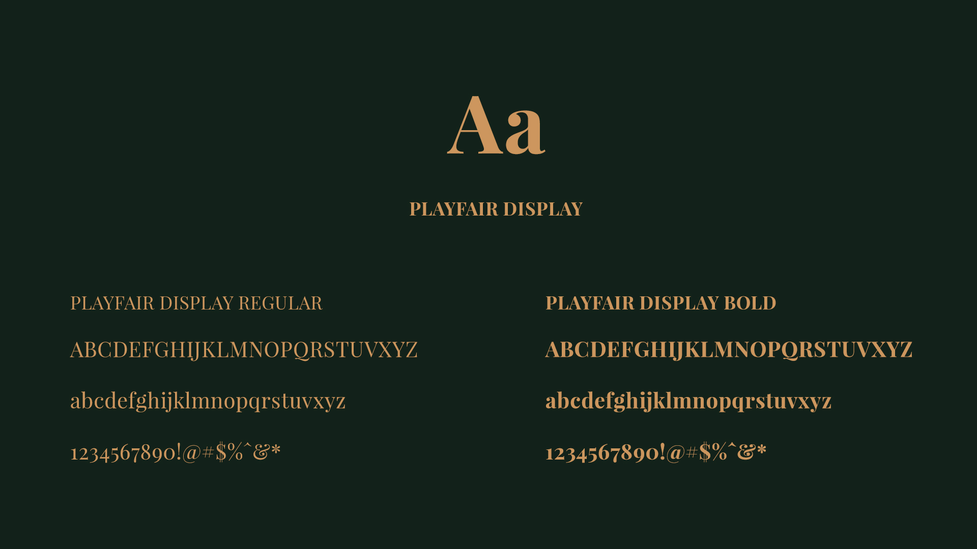
PLAYFAIR DISPLAY
For the brand’s primary typeface, we selected Playfair Display in both its regular and bold weights. As a serif typeface, it brings elegance and a sense of tradition, helping to achieve the desired look and feel: a brand that is refined, timeless, and still distinctive.
Serif typography naturally conveys sophistication, yet Playfair strikes a balance by avoiding the heaviness of more classical typefaces. It is used primarily in the logo and across titles in all brand materials.
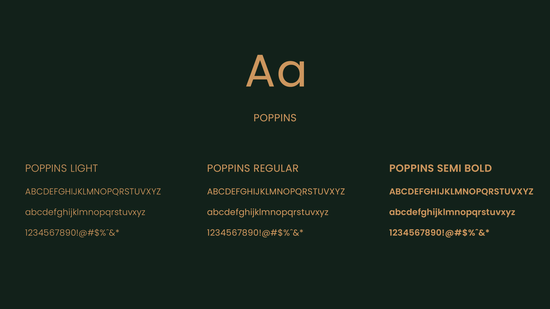
POPPINS
In contrast to Playfair, Poppins is a sans-serif typeface chosen to ensure clarity, modernity, and versatility in the brand’s communication. Its geometric design conveys structure and contemporaneity, balancing the classic sophistication of Playfair with a cleaner, more objective presence.
Poppins Regular is used for body text, ensuring excellent legibility across both digital and print formats. The SemiBold weight is applied to subtitles, creating a consistent visual hierarchy, while the Light variation may be used selectively in website headings, reinforcing a sense of lightness and elegance in the digital experience.
This combination allows the brand to engage with the fashion universe in a contemporary, structured, and accessible way, without compromising its refinement.
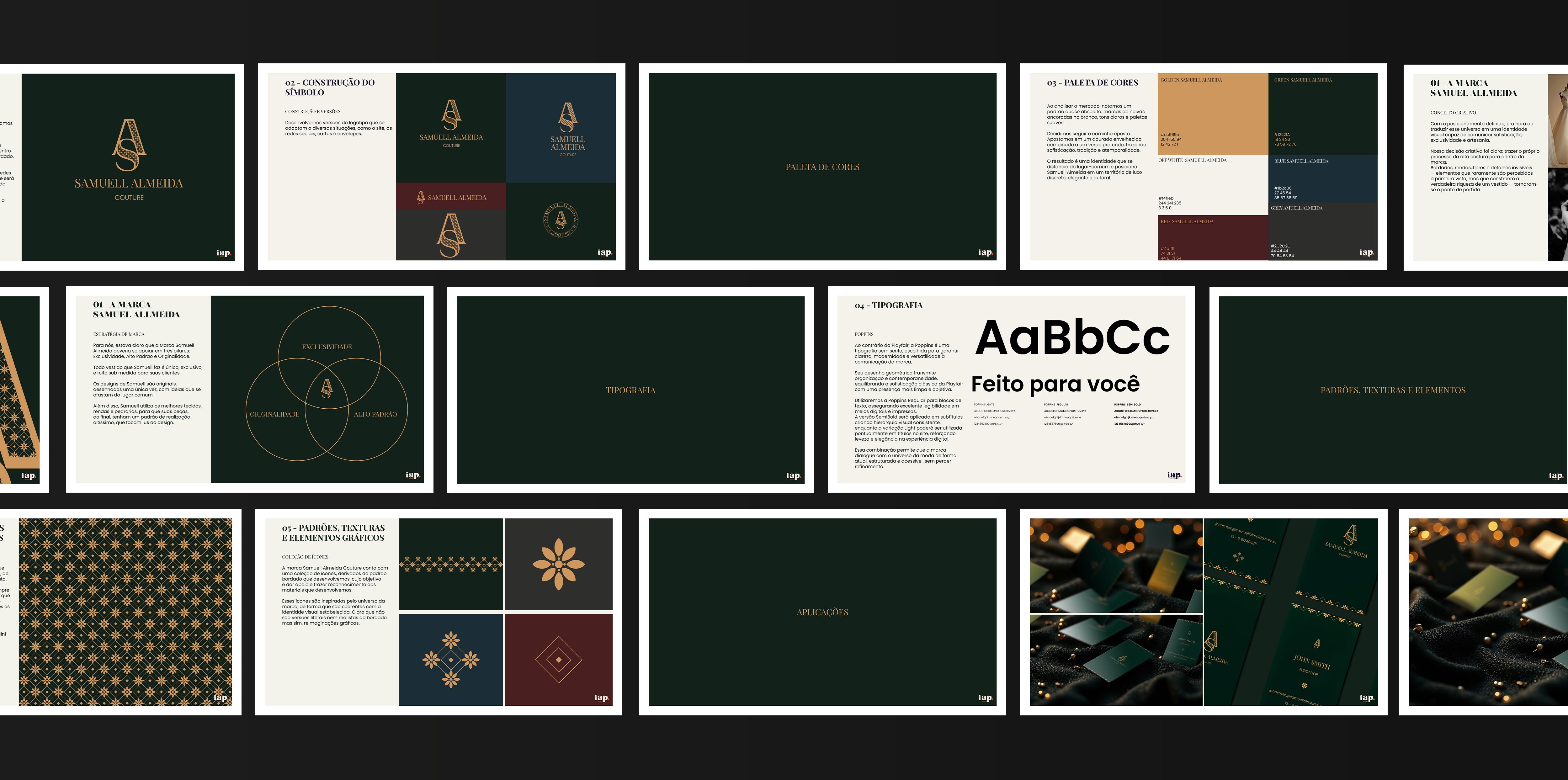
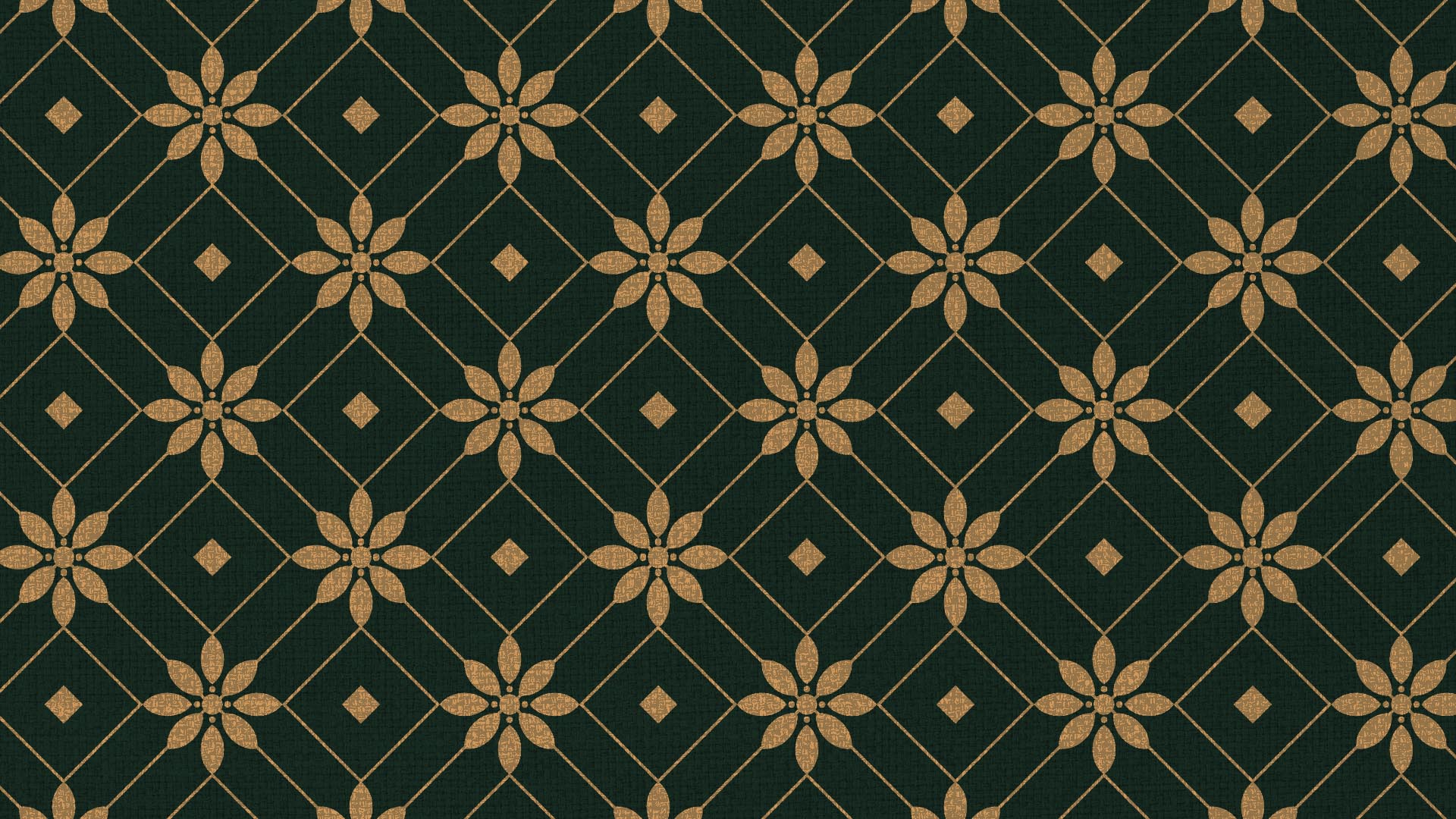
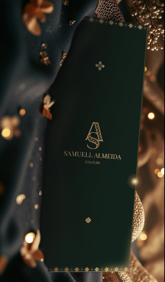
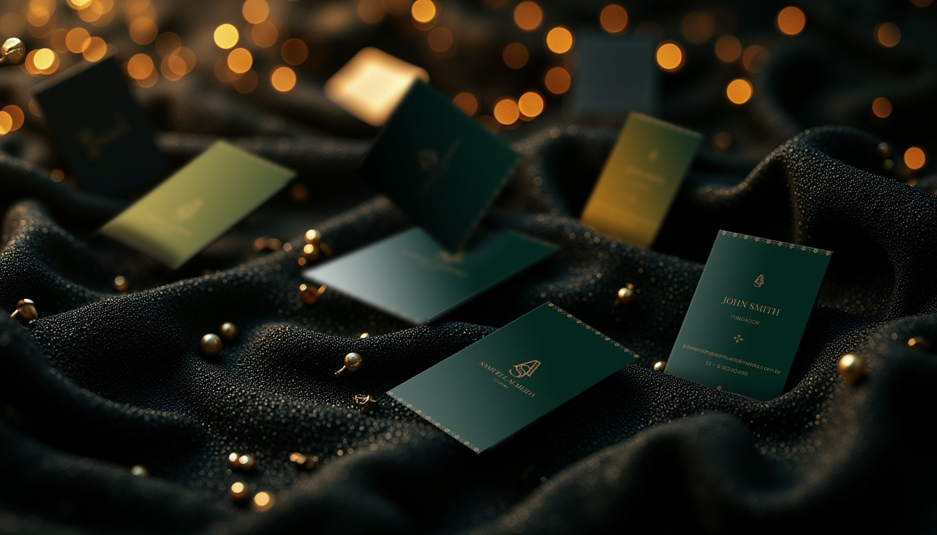
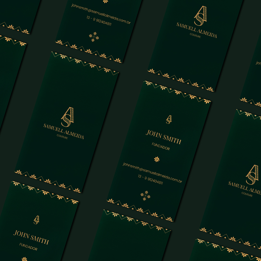
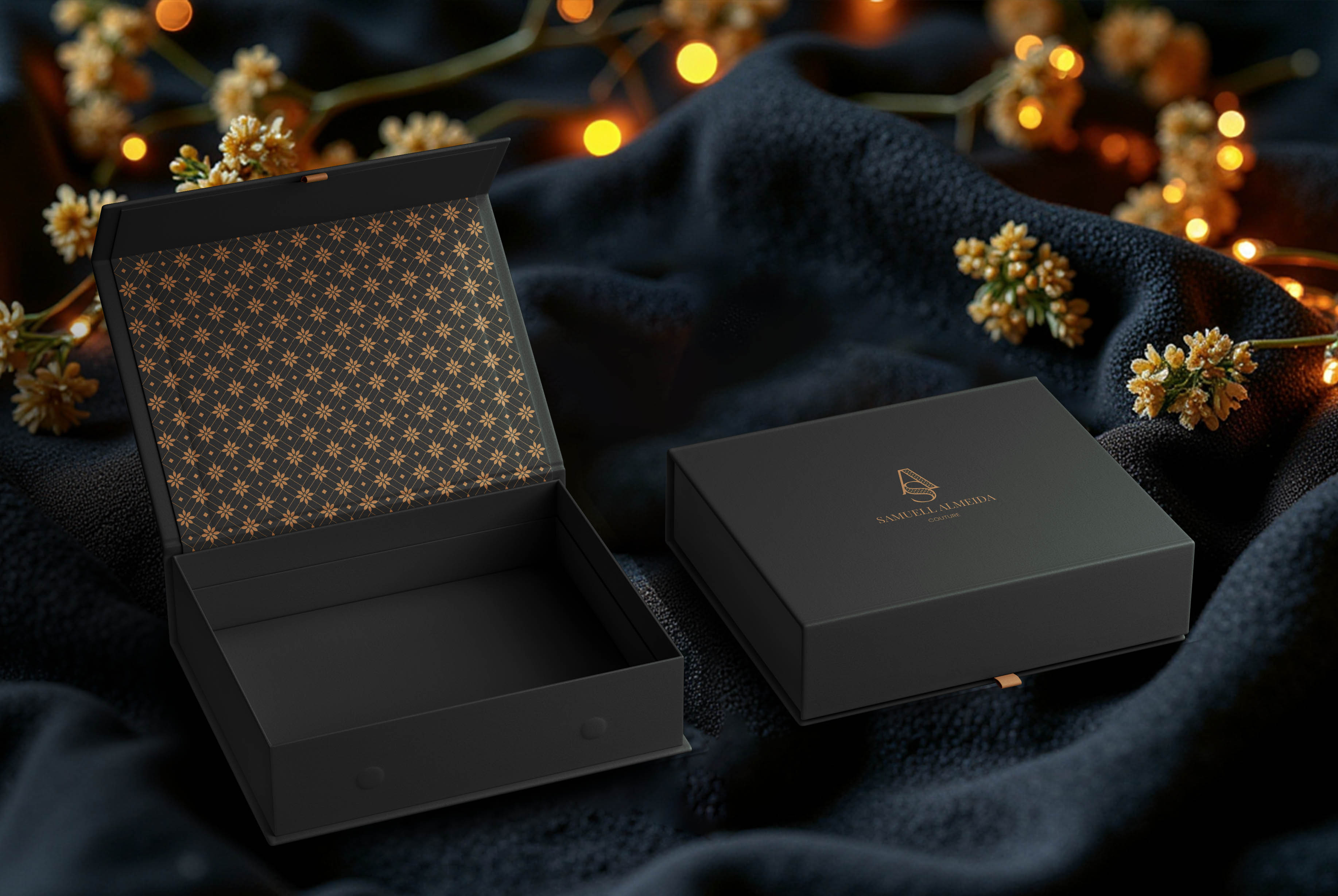
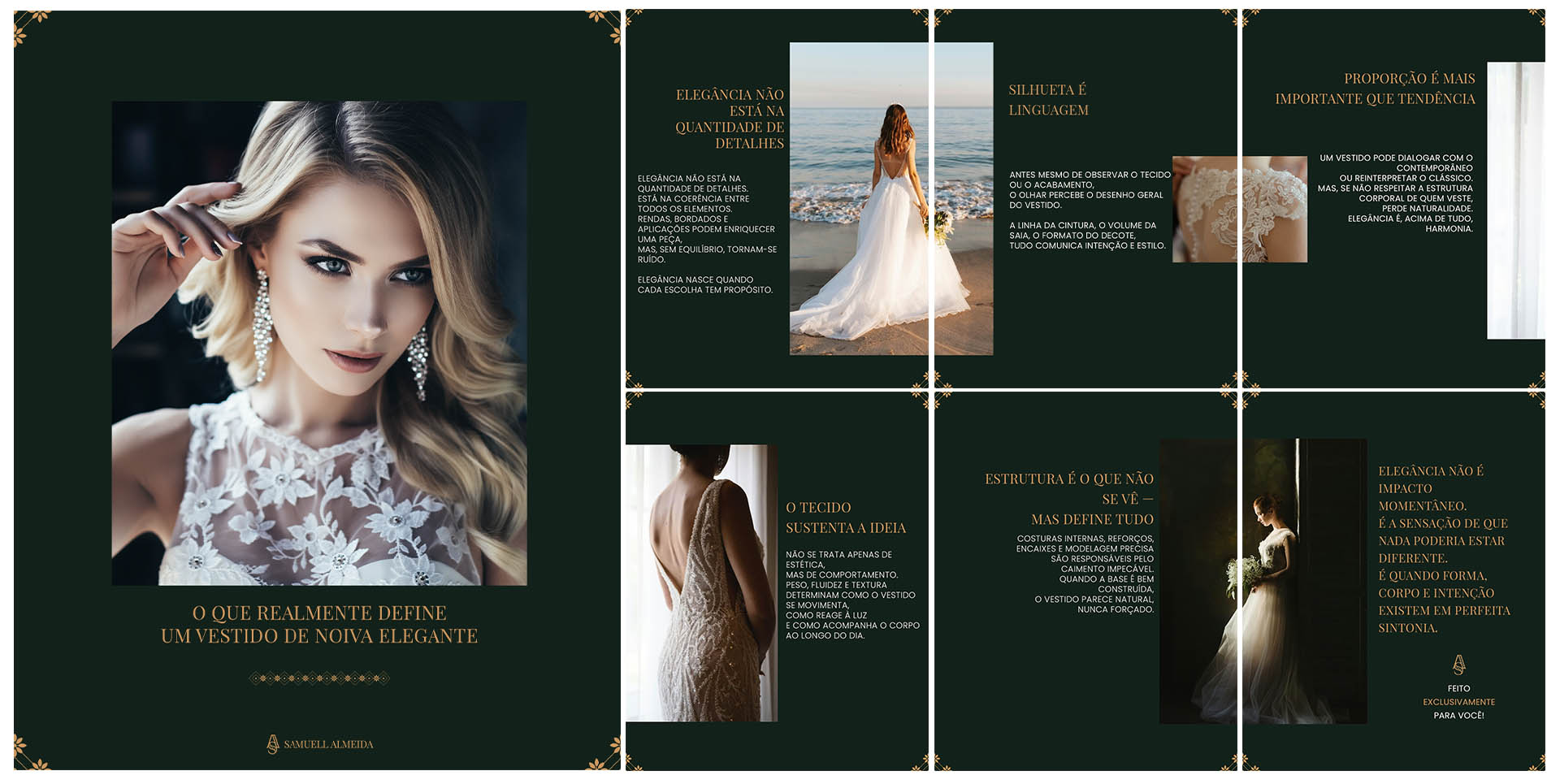
As part of the brand’s visual language, we developed a pattern inspired by embroidery and lace fabrics, not in a literal sense, but through an abstract interpretation. The application follows a clear rule: the embroidery is always rendered in gold over a green background, aligning with the logo system. The golden pattern was designed to remain versatile, working seamlessly across all backgrounds within the color palette.
From this foundation, we developed a set of three icons, applied across various brand touchpoints, particularly in stationery, the website, and editorial mini lookbooks.
ICON COLLECTION
Samuell Almeida Couture features a collection of icons derived from the embroidered pattern, designed to support and reinforce brand recognition across different materials.
These icons draw directly from the brand’s universe, ensuring consistency with the established visual identity. Rather than literal or realistic representations of embroidery, they function as graphic reinterpretations — translating craftsmanship into a refined visual system.
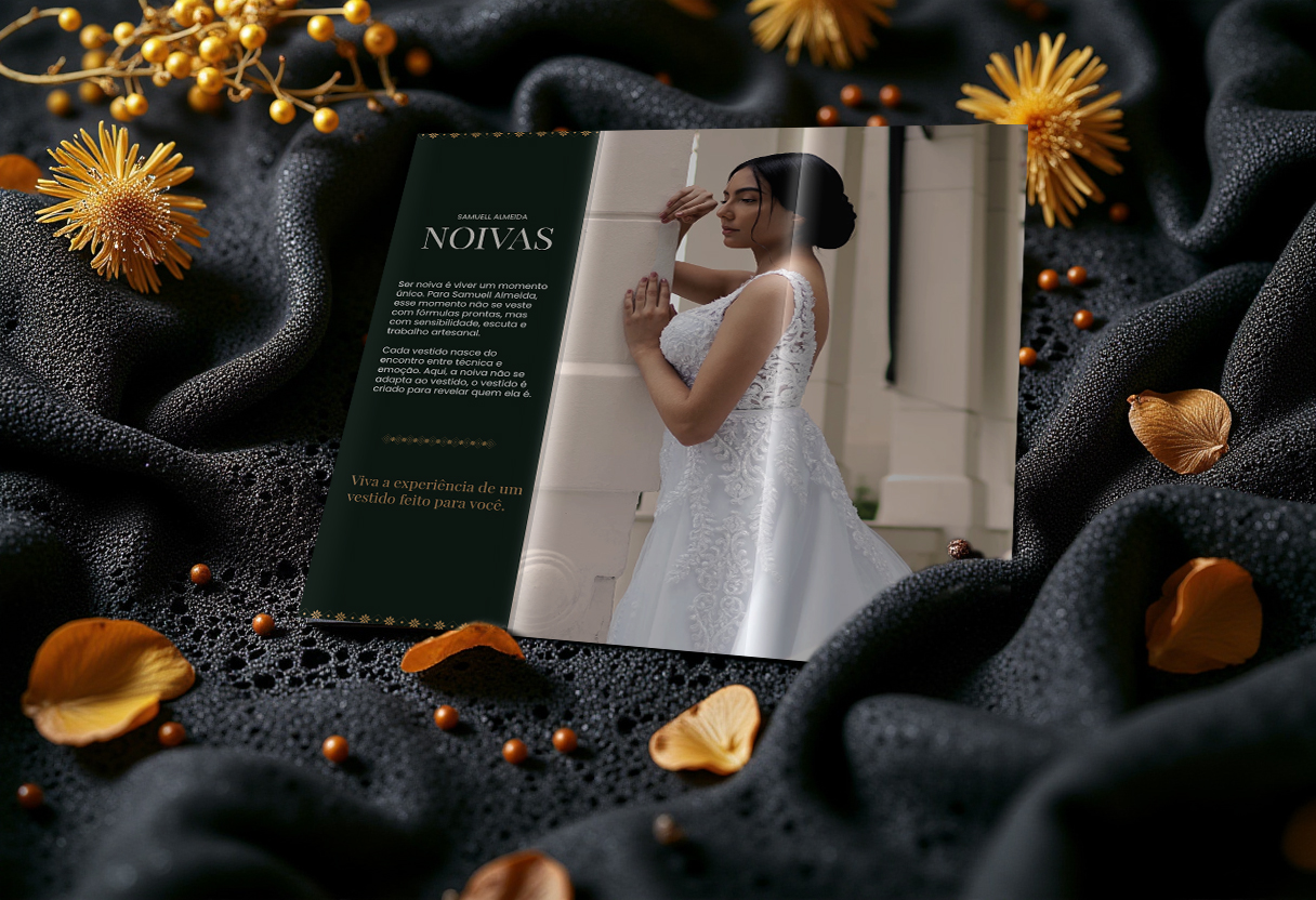

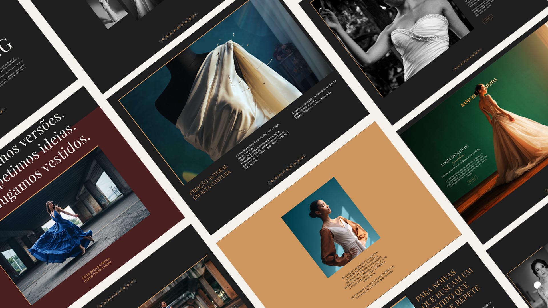
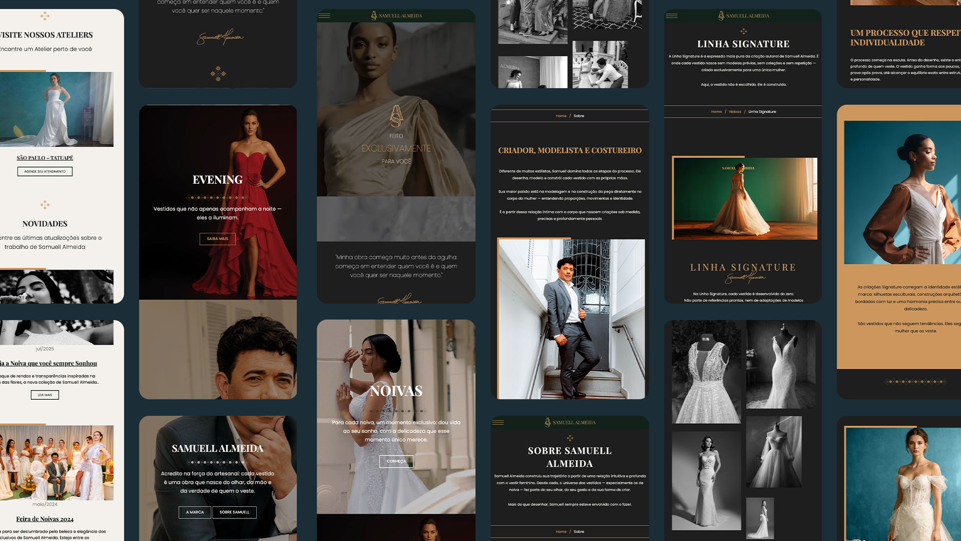
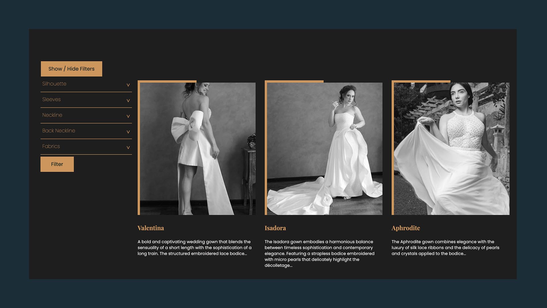
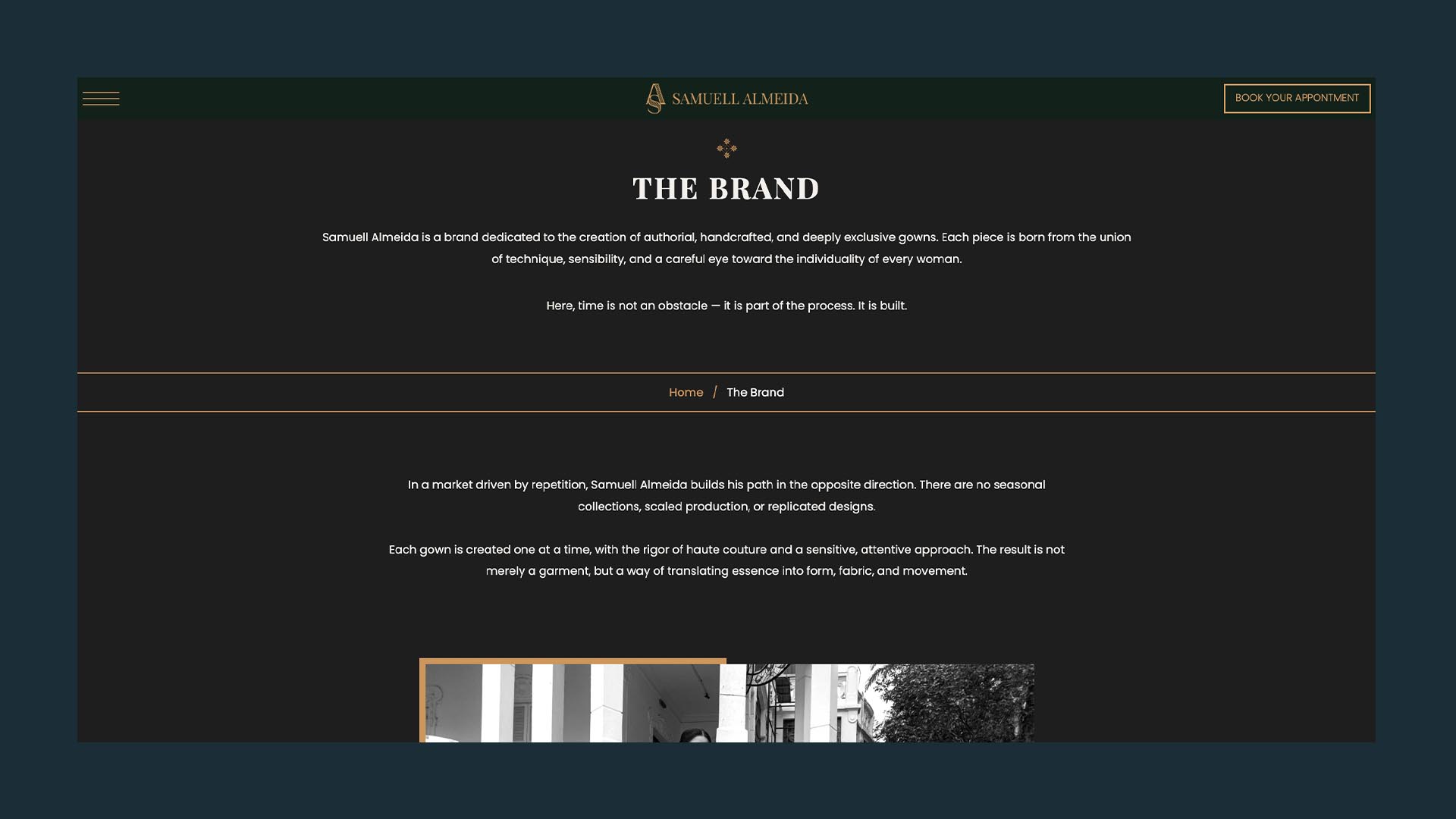
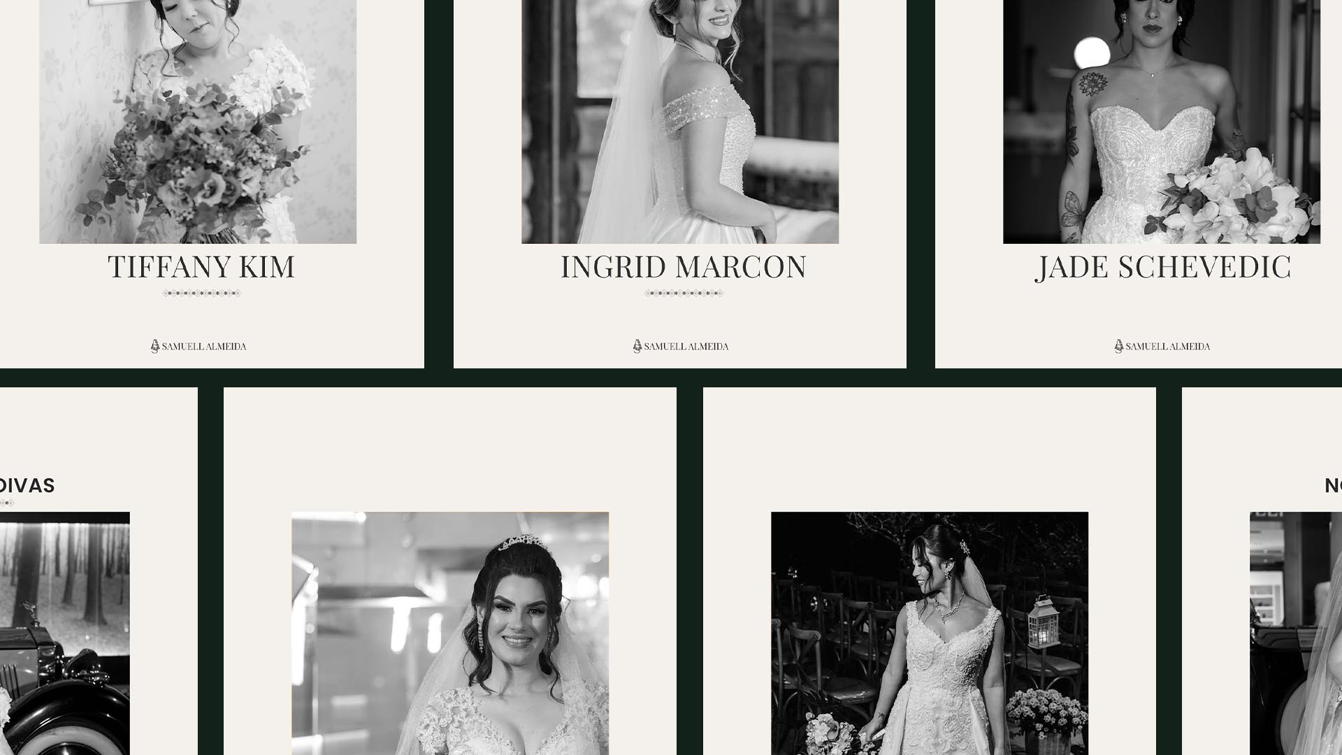
Samuell Almeida’s website was conceived as a natural extension of the atelier, a digital space designed to faithfully translate the brand’s elegance, craftsmanship, and bespoke essence. More than just a showcase, the experience incorporates the visual identity, textures, and delicacy of the bridal universe, creating an environment that gradually reveals itself, much like each dress created by Samuell. The result is a refined and highly functional website that presents his services with clarity, while also supporting scheduling, appointment bookings, and campaign-driven landing pages.
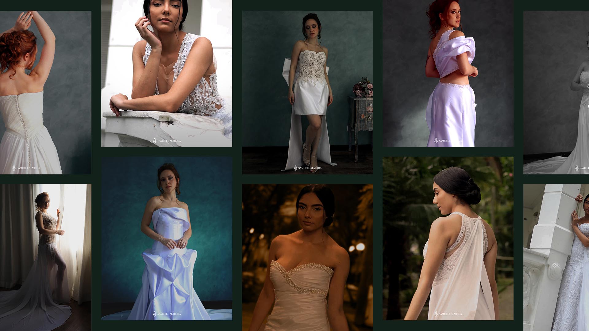
Samuell Almeida’s launch campaign was built from a sensitive observation of the product itself: the dress. Even before the brand’s positioning was fully defined, the captured material already revealed what would later become its core territory, detail, movement, and the singularity of each creation.
The film is structured around repetition and transformation. The same model moves through different dresses, revealing, with each turn, new shapes, textures, and identities. This continuous transition reinforces the idea of exclusivity: each piece is unique, even as all share the same level of craftsmanship. The text inserts: “made exclusively”, “made uniquely”, “made only”, “made to measure” , create a conceptual crescendo, guiding the narrative toward its central message.
In the final moment, the model’s distant gaze opens space for the closing line: “for you.” It is here that the campaign moves beyond the dresses themselves and speaks to destiny, choice, and individuality. What begins as contemplation becomes connection.
Even though it was conceived before the brand’s formal positioning, the campaign aligns organically with its core pillars: exclusivity, craftsmanship, and bespoke creation, translating into image and rhythm what now defines Samuell Almeida. The result is a narrative that not only introduces the brand, but does so with clarity and sensitivity, establishing a strong and memorable presence from the very beginning.