

Ivan Canan
Ivan Canan's identity stems from his own signature to create a visual system based on rhythm, repetition, and modernist curves.
Butiá is a handbag brand that embraces a new perspective on luxury: more understated, timeless, and connected to time.
Inspired by the nature, landscapes, and architecture of South America, the brand creates pieces that bring together elegance, functionality, and quality to accompany different moments in life.
No bright colors, Carnival, or toucans.
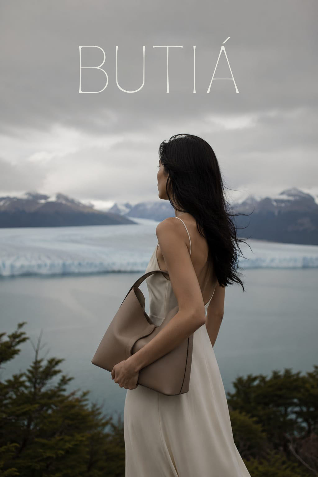
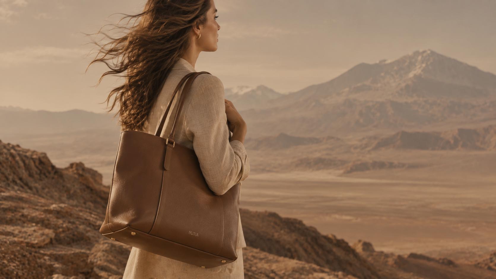
Rather than relying on the continent’s most obvious representations, the brand finds inspiration in a quieter landscape: mountains, open fields, architecture, coastlines, roads, and cities where beauty reveals itself without excess.
This territory translates a contemporary idea of sophistication. An elegance that does not depend on ostentation, but on quality, permanence, and the things worth taking the time to notice.
Butiá’s visual identity grows from this same principle. Organic forms, natural tones, and a clean aesthetic create a language that brings nature and sophistication, tradition and contemporaneity together.
More than representing a place, BUTIÁ represents a way of seeing it.
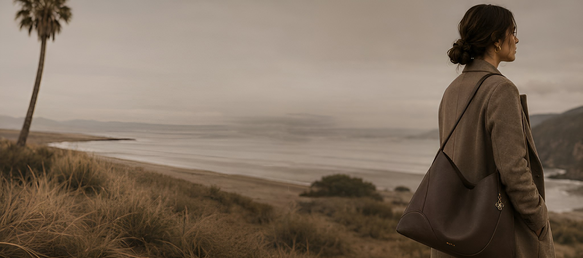
In a world shaped by speed and excess, Butiá proposes a more conscious relationship with time and with the things we choose to carry with us.
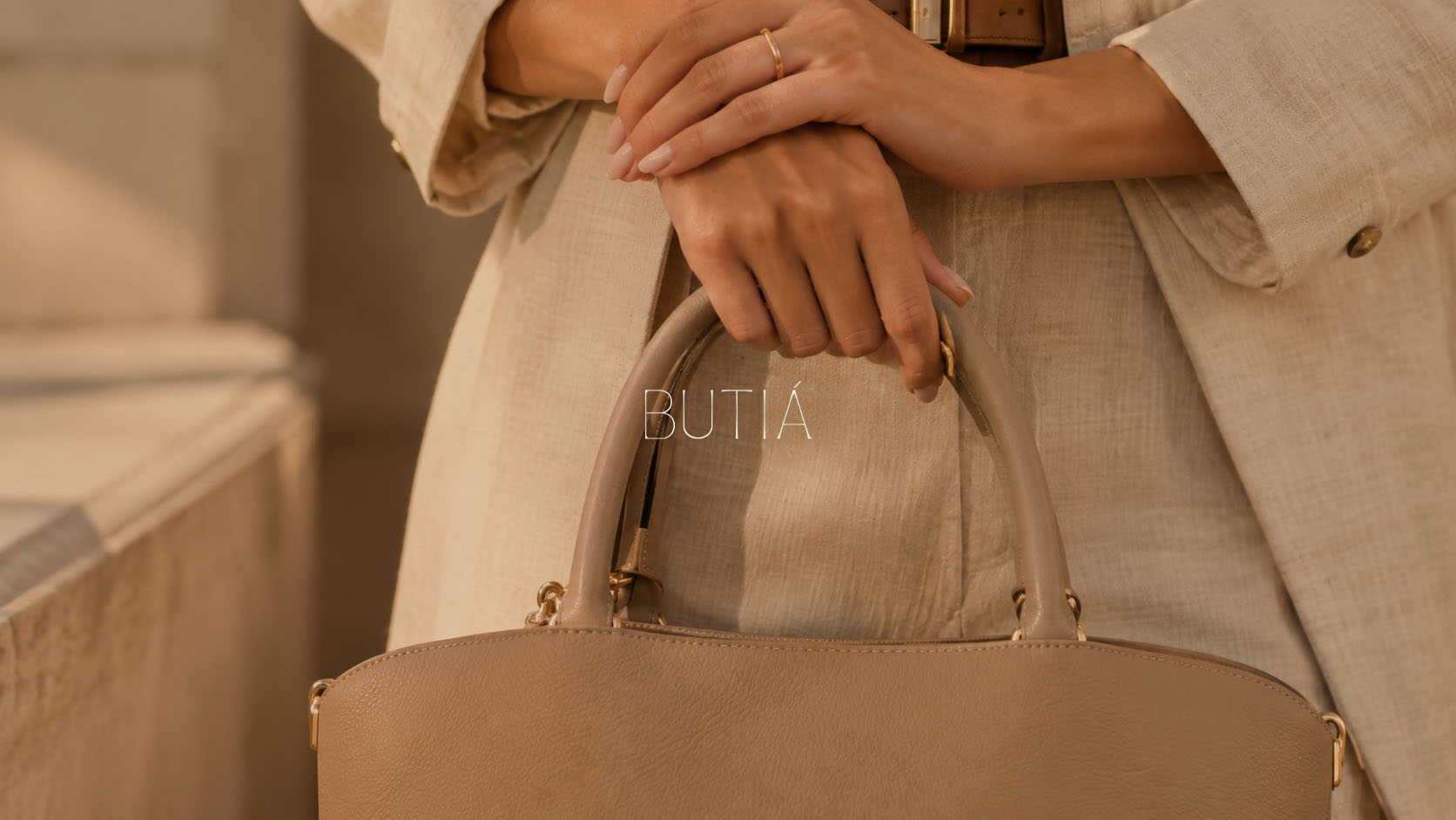
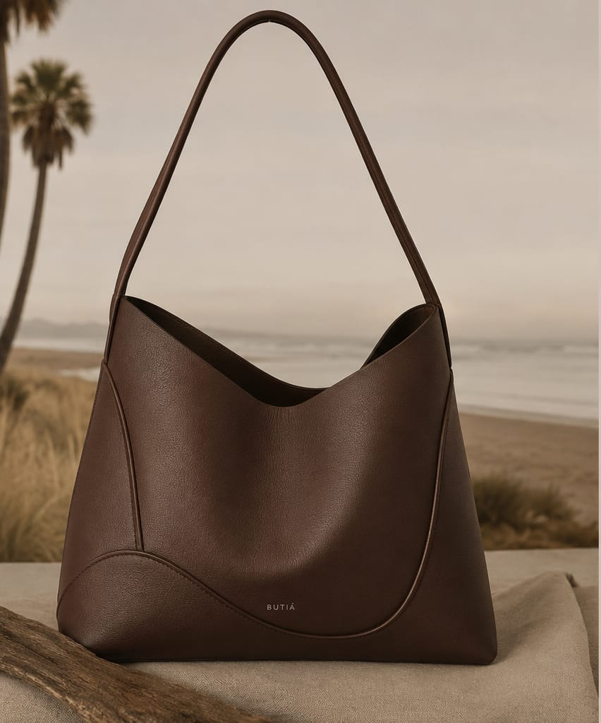
Its bags are designed to accompany different moments in life, from everyday routines to journeys, bringing together functionality, quality, and an aesthetic made to endure.
The brand believes that the objects we carry with us can also carry stories. Each piece is therefore designed to age beautifully, gain meaning, and remain present over time.
Luxury, to Butiá, does not need to be obvious.
It lives in the material, the detail, the choice, and in what remains.
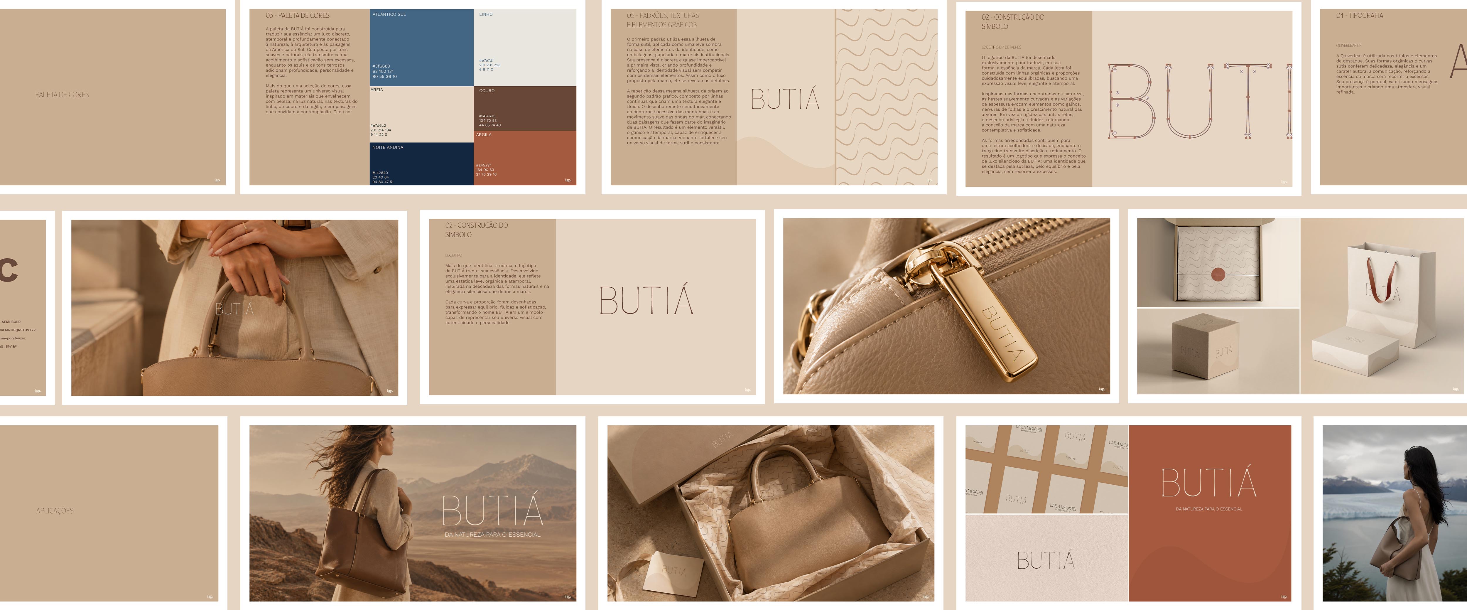
Butiá’s identity begins with a direct relationship with nature, but does not seek to reproduce it literally.
Its forms are inspired by the fluidity of natural elements, the lines found in landscapes, and the organic shapes of leaves, branches, and mountains.
This reference appears subtly throughout the identity: in the design of the logo, in its curves, in the color palette, and in the graphic elements.
The result is a light and sophisticated visual language, created to convey presence without excess.
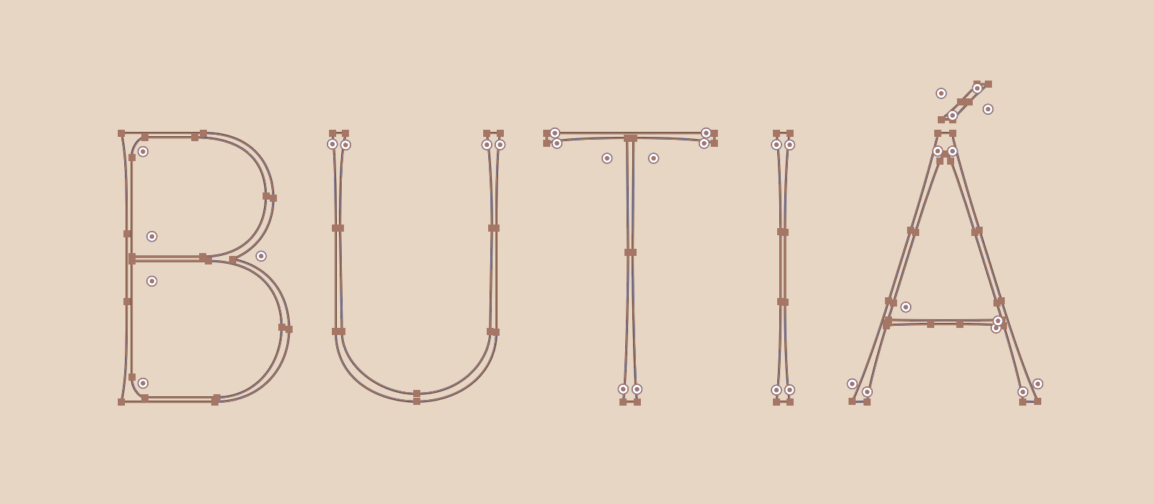
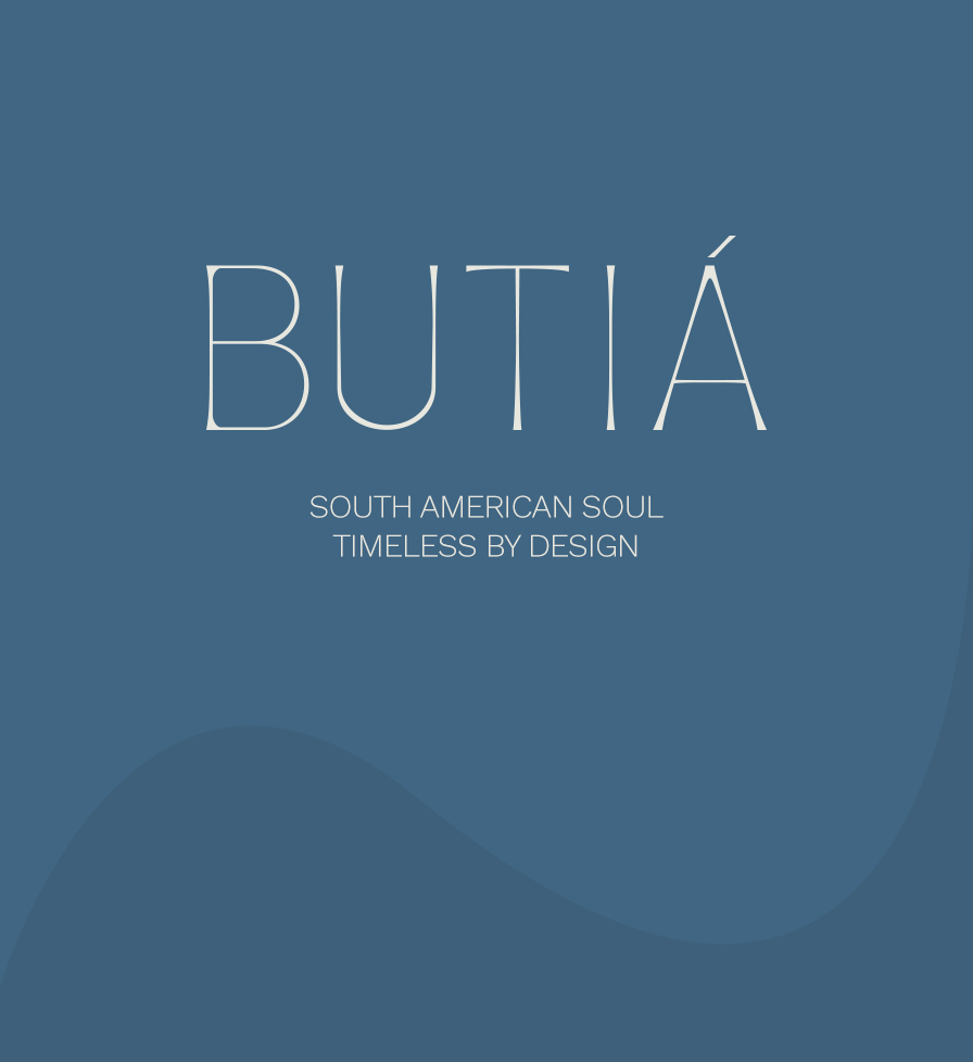
Butiá’s logo was exclusively designed to translate the essence of the brand into a distinctive visual form.
Its letterforms move away from the rigidity of straight lines and embrace soft curves, creating an organic, delicate, and timeless design.
The curved stems and variations in weight reference natural elements, branches, veins, and patterns of organic growth, while the fine strokes reinforce the idea of understated sophistication.
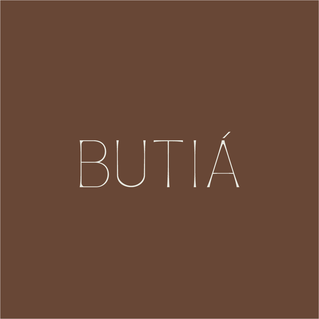
More than a signature, the logo expresses BUTIÁ’s personality: natural, elegant, and quietly confident.
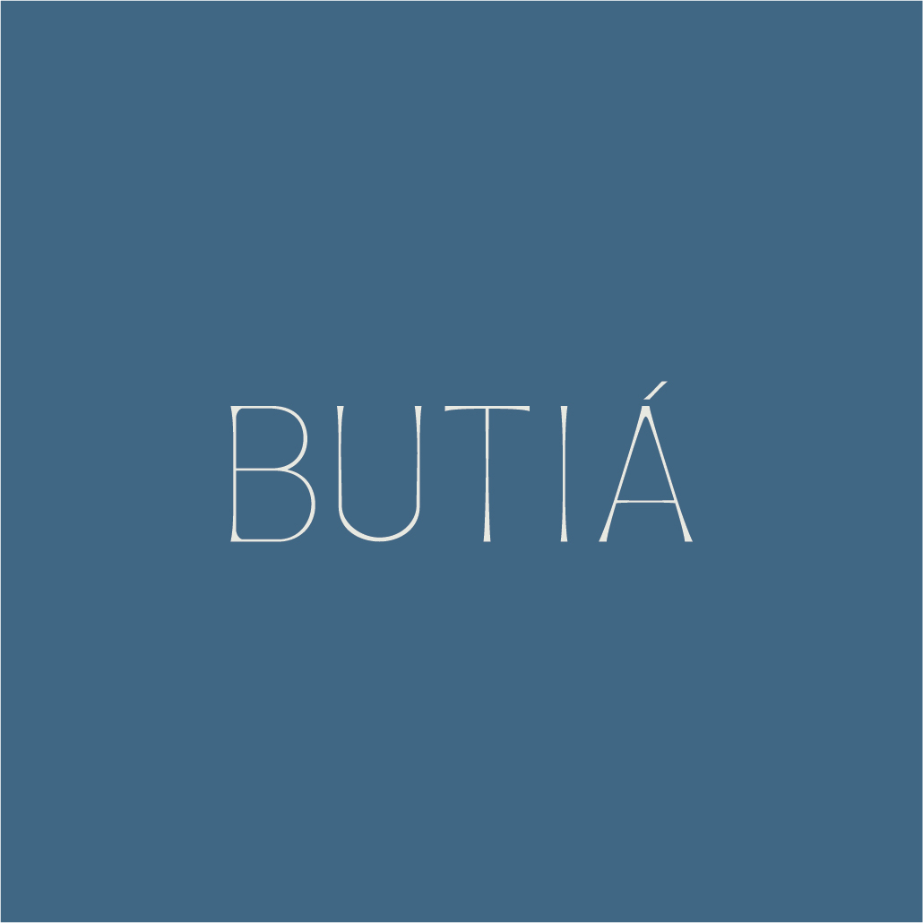
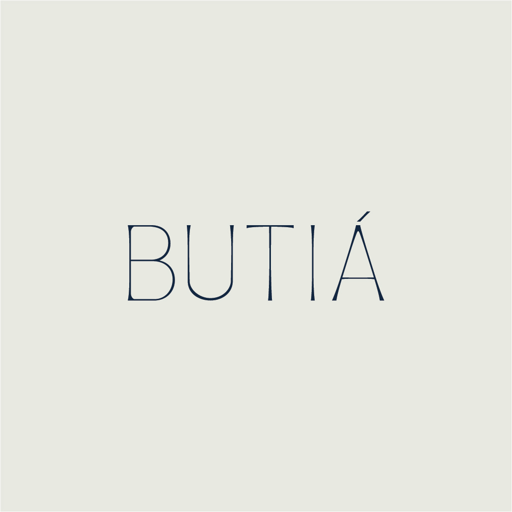
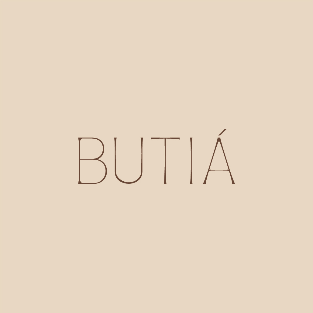

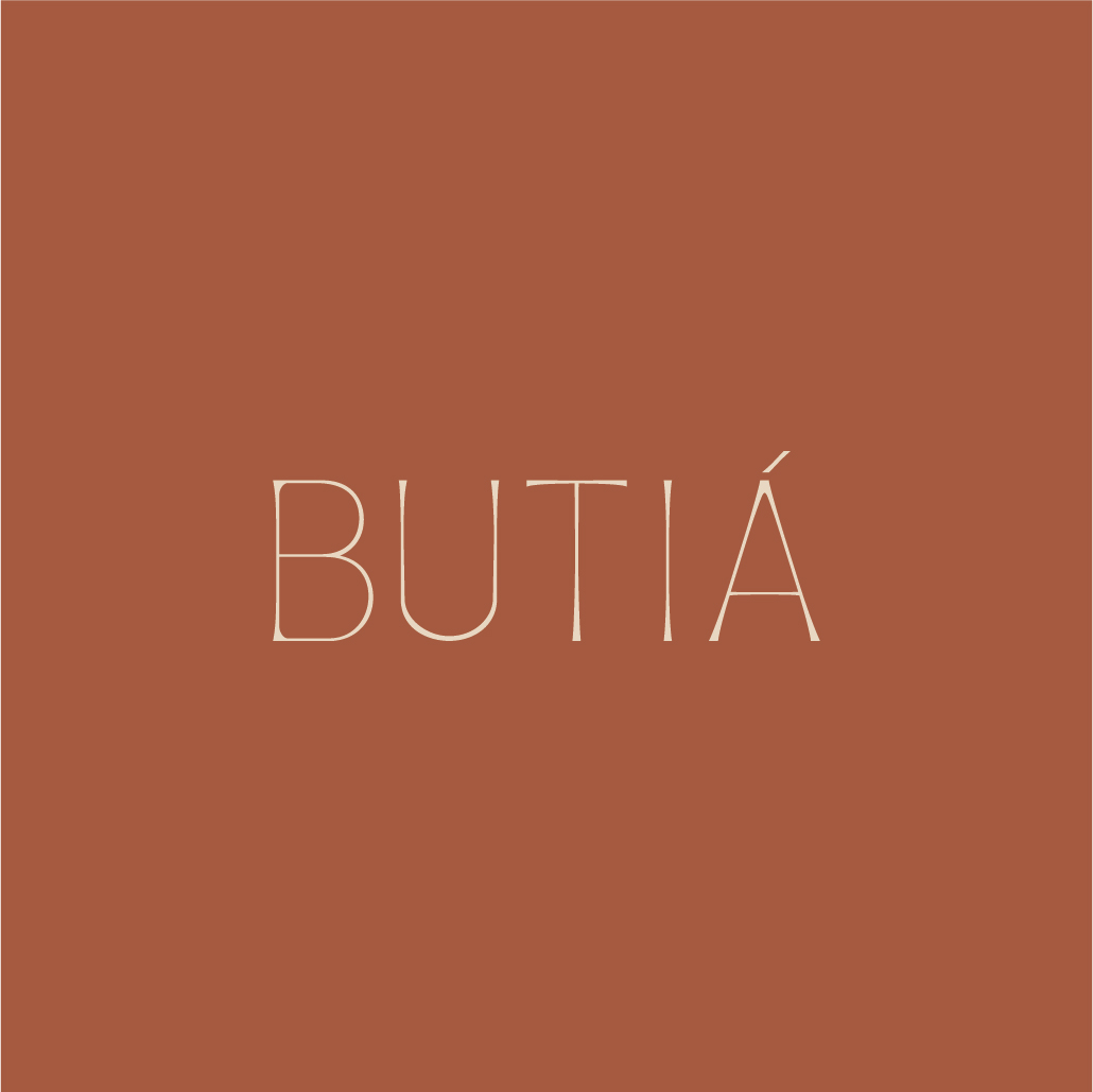
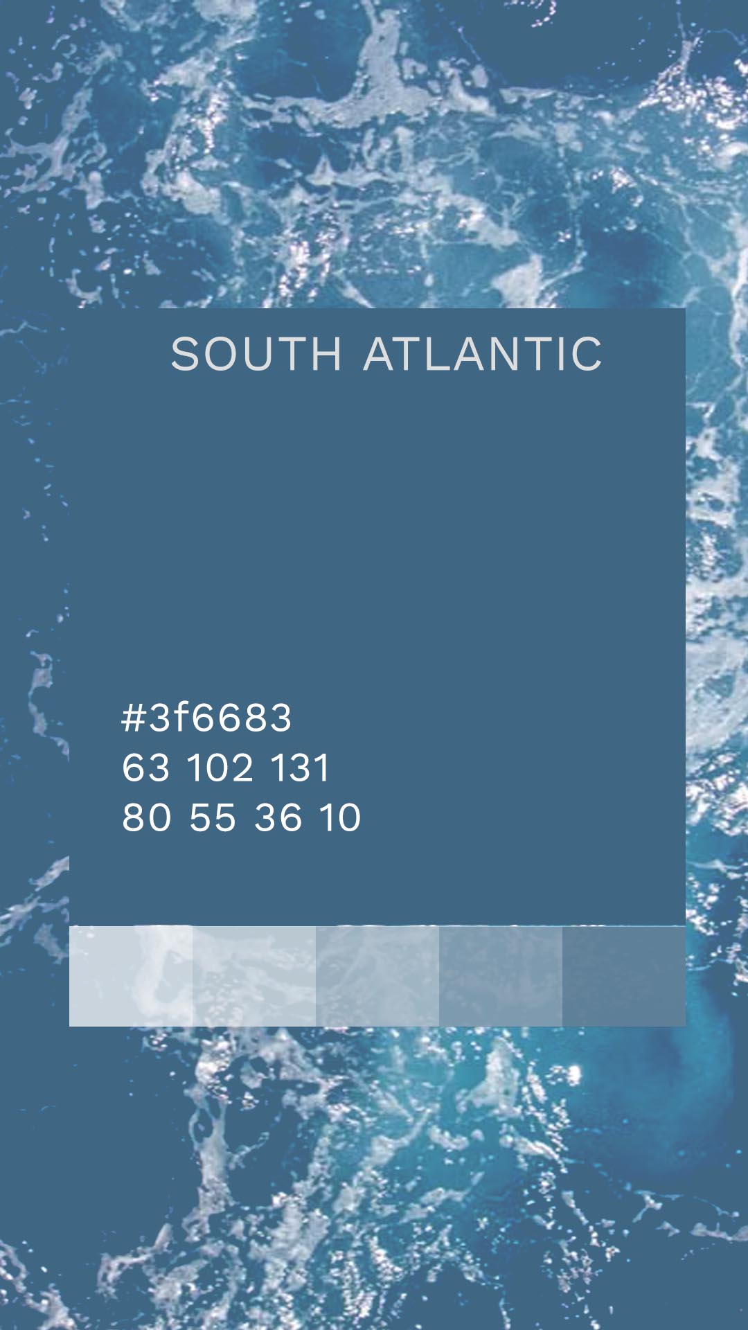
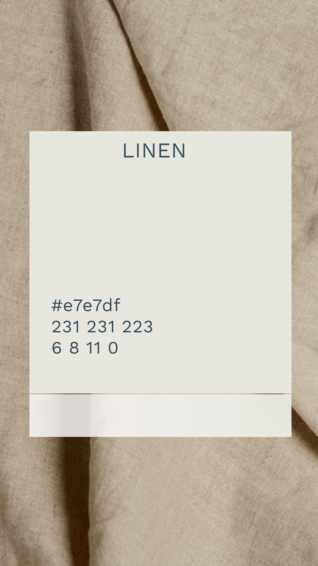
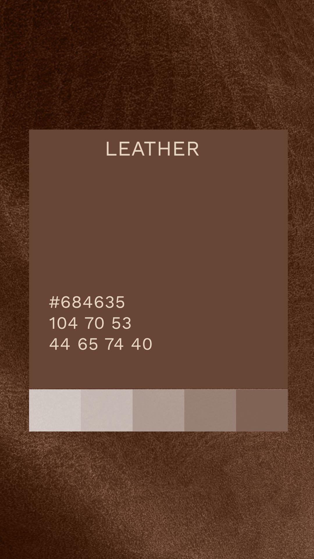
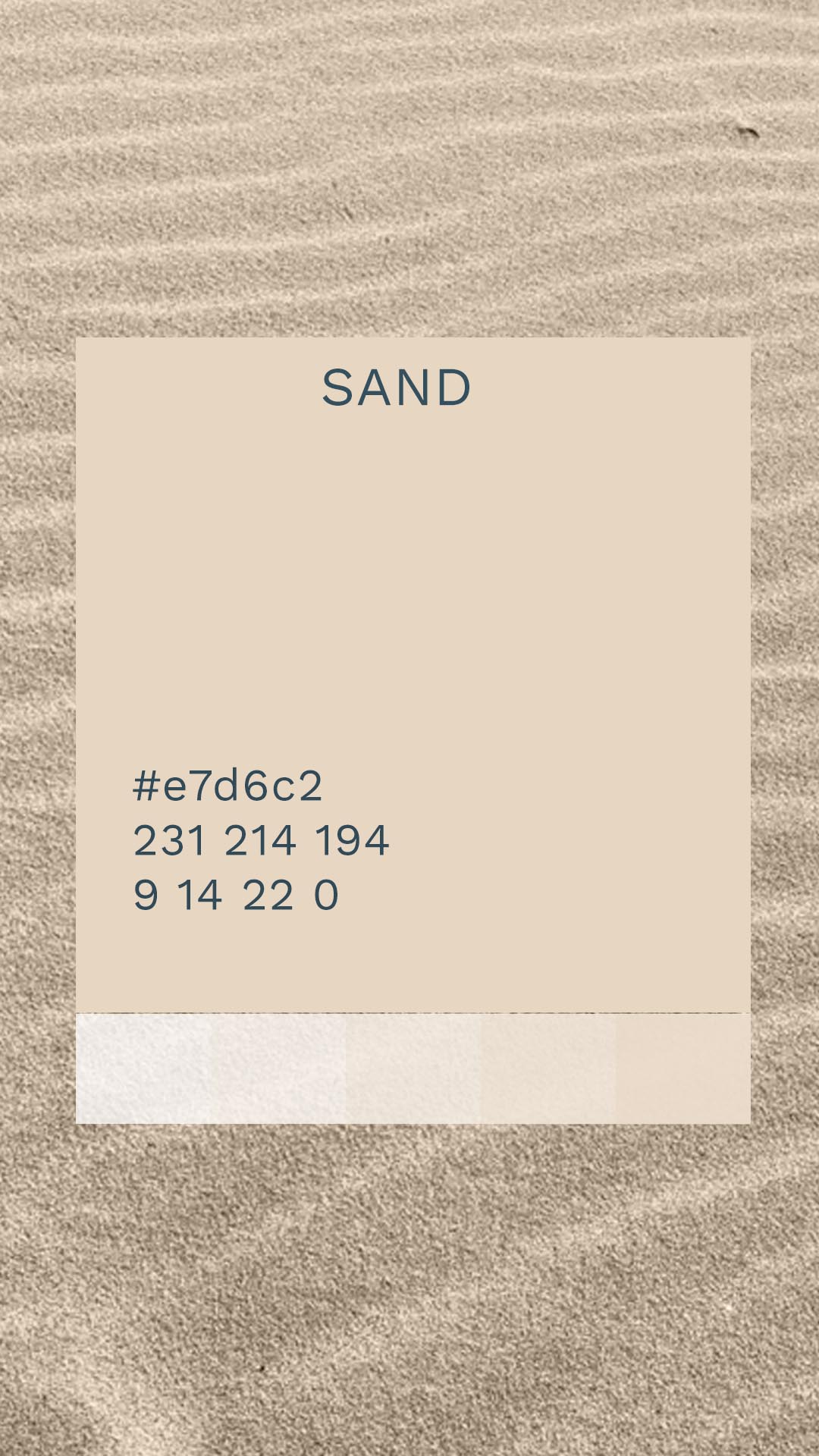
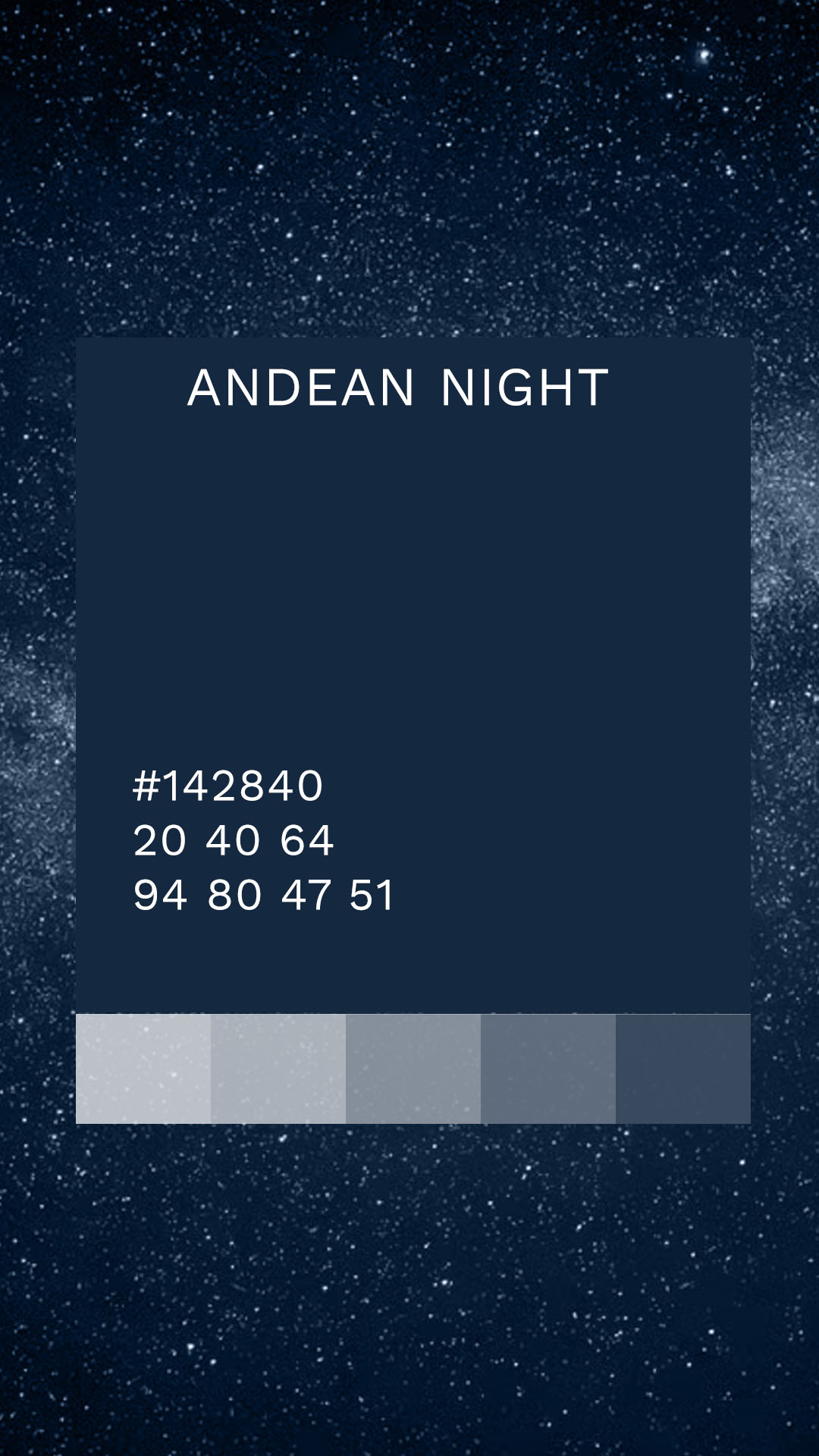
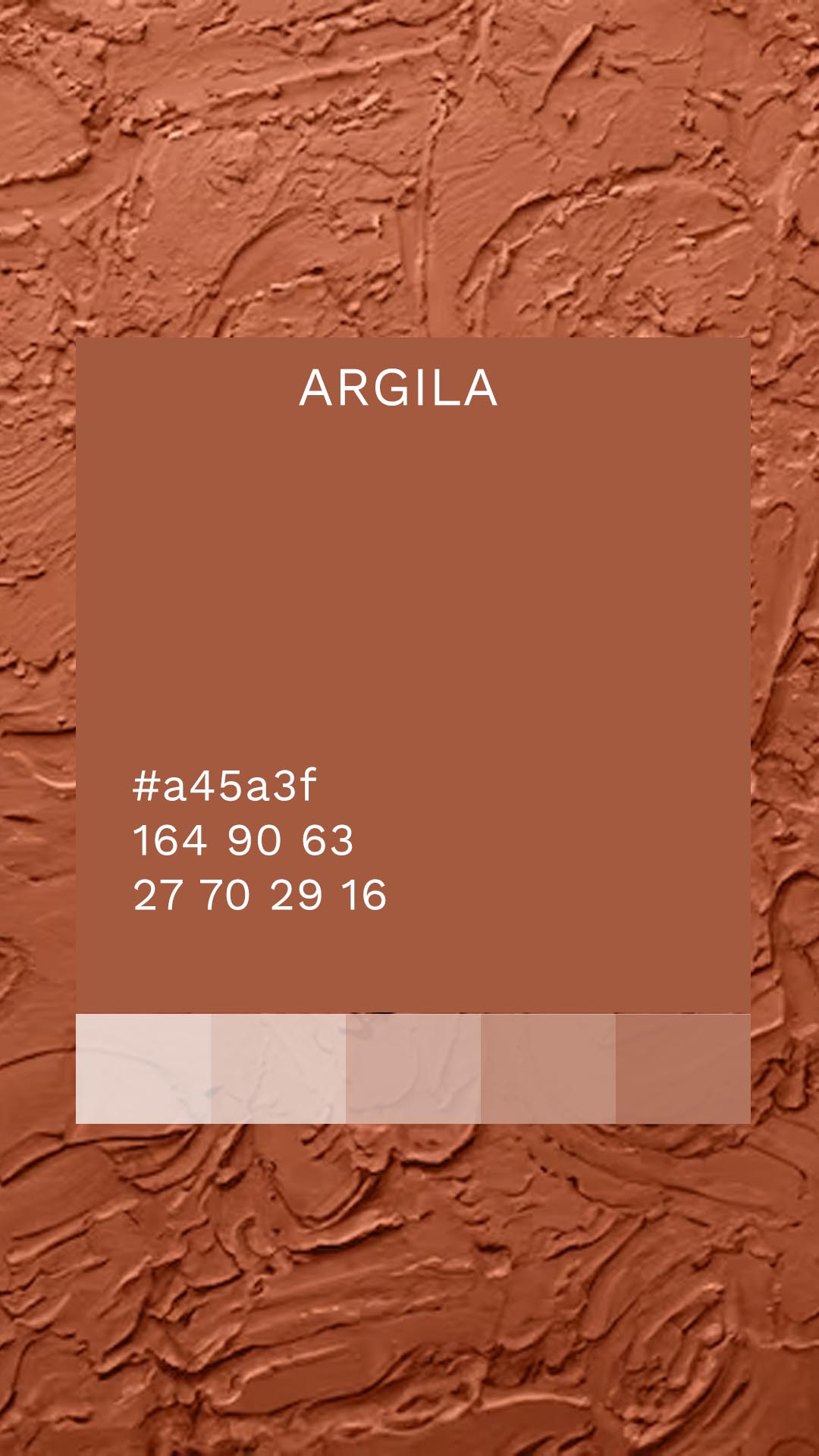
Butiá’s color palette was built around the meeting point between nature, materiality, and landscape.
Tones of linen, stone, leather, and clay establish a natural and welcoming foundation. The blues add depth and evoke the horizon, the sky, and the open landscapes that belong to the brand’s universe.
The combination creates a balance between softness and personality. Lighter tones provide a sense of ease and an enduring presence, while deeper colors are introduced selectively to create contrast and sophistication.
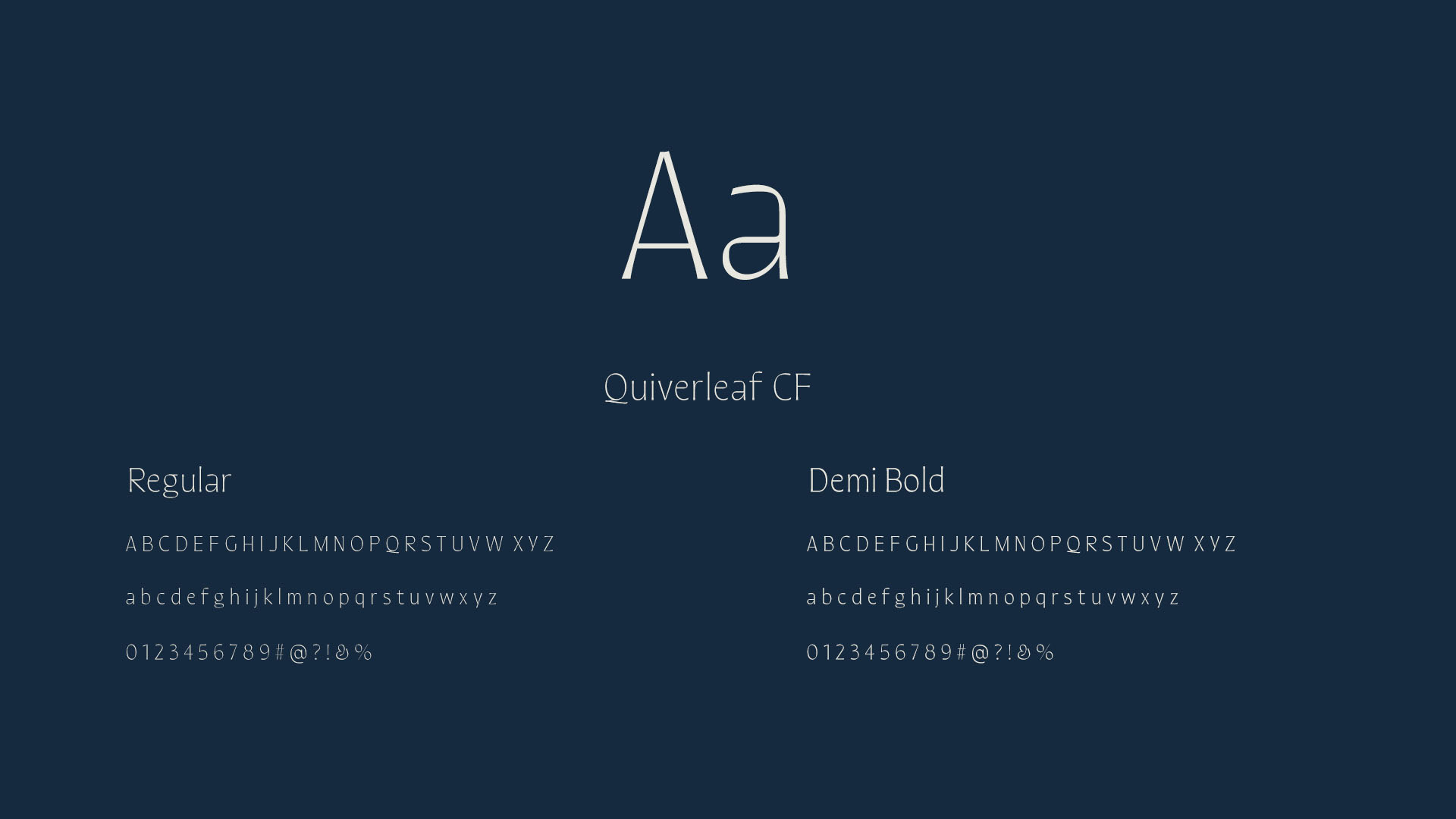
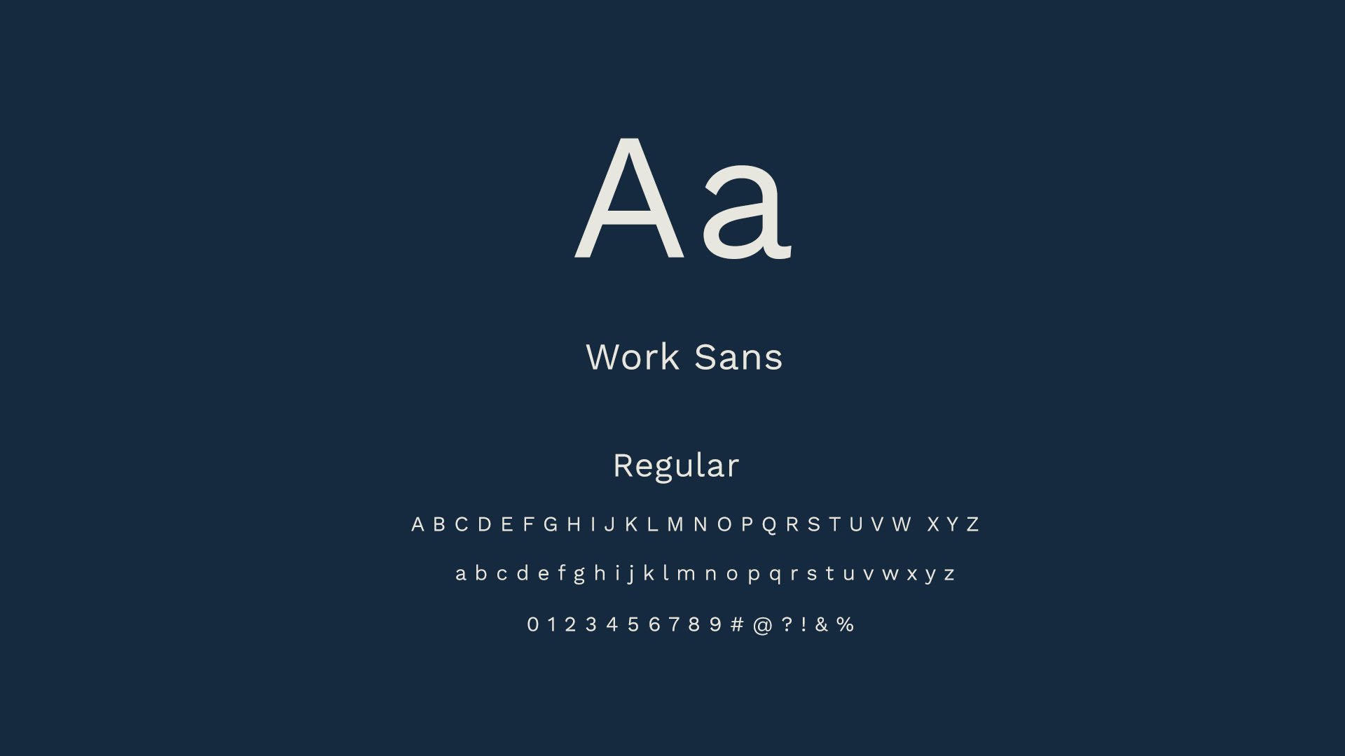
Butiá’s typography balances personality and functionality.
Quiverleaf is used for titles and moments of emphasis, bringing an organic quality, delicacy, and a more distinctive presence to the communication.
In contrast, Work Sans is used for supporting texts and informational content. Its clean, contemporary design ensures readability and balance, allowing the communication to remain clear and sophisticated.
Together, the two typefaces establish the same contrast found throughout the identity: sensitivity and precision, nature and construction, expression and silence.
Butiá’s patterns originate from the silhouette of the Andes Mountains.
The choice of this reference reinforces the brand’s particular perspective on South America, a continent seen through its landscapes, its depth, and its less obvious beauty.
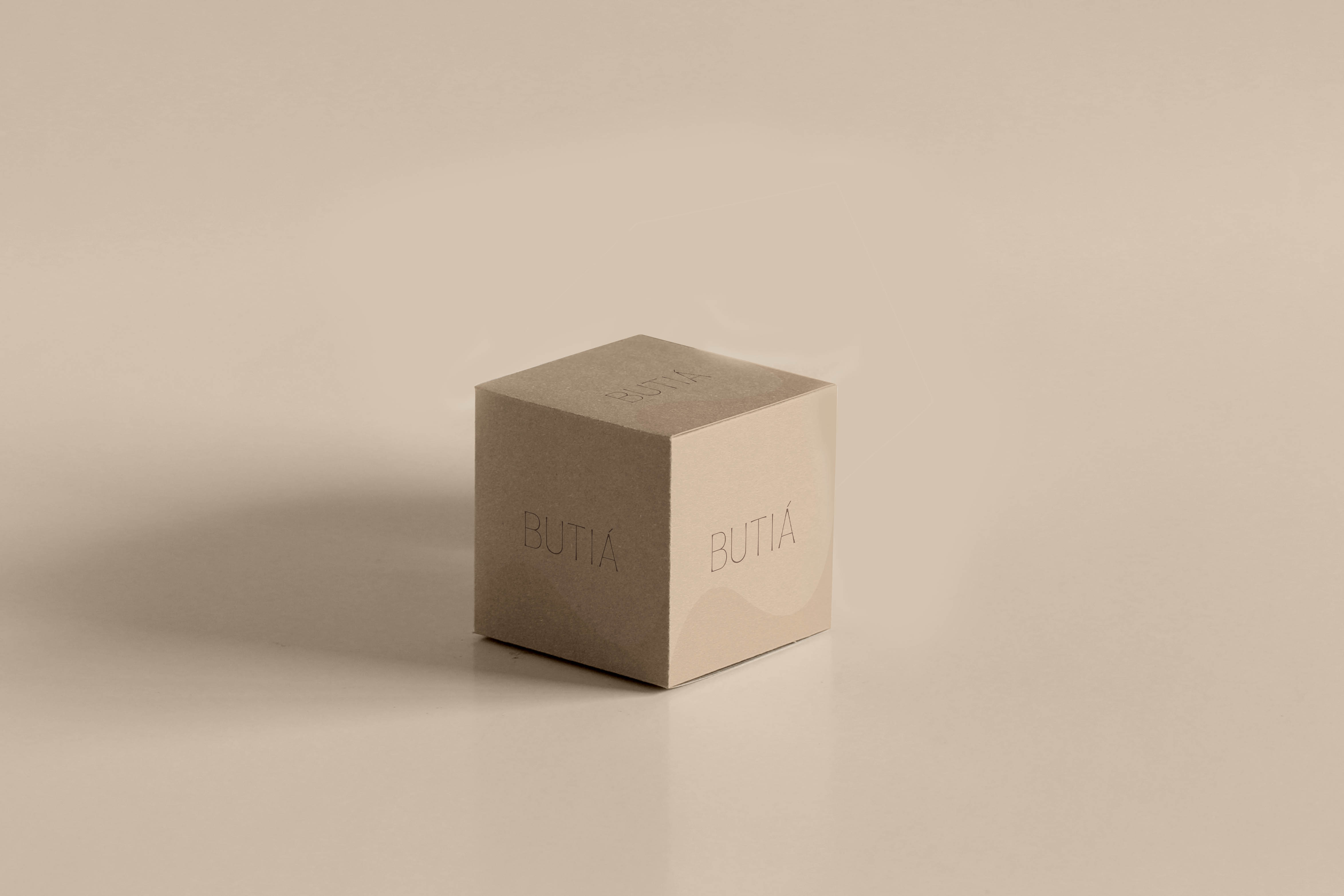
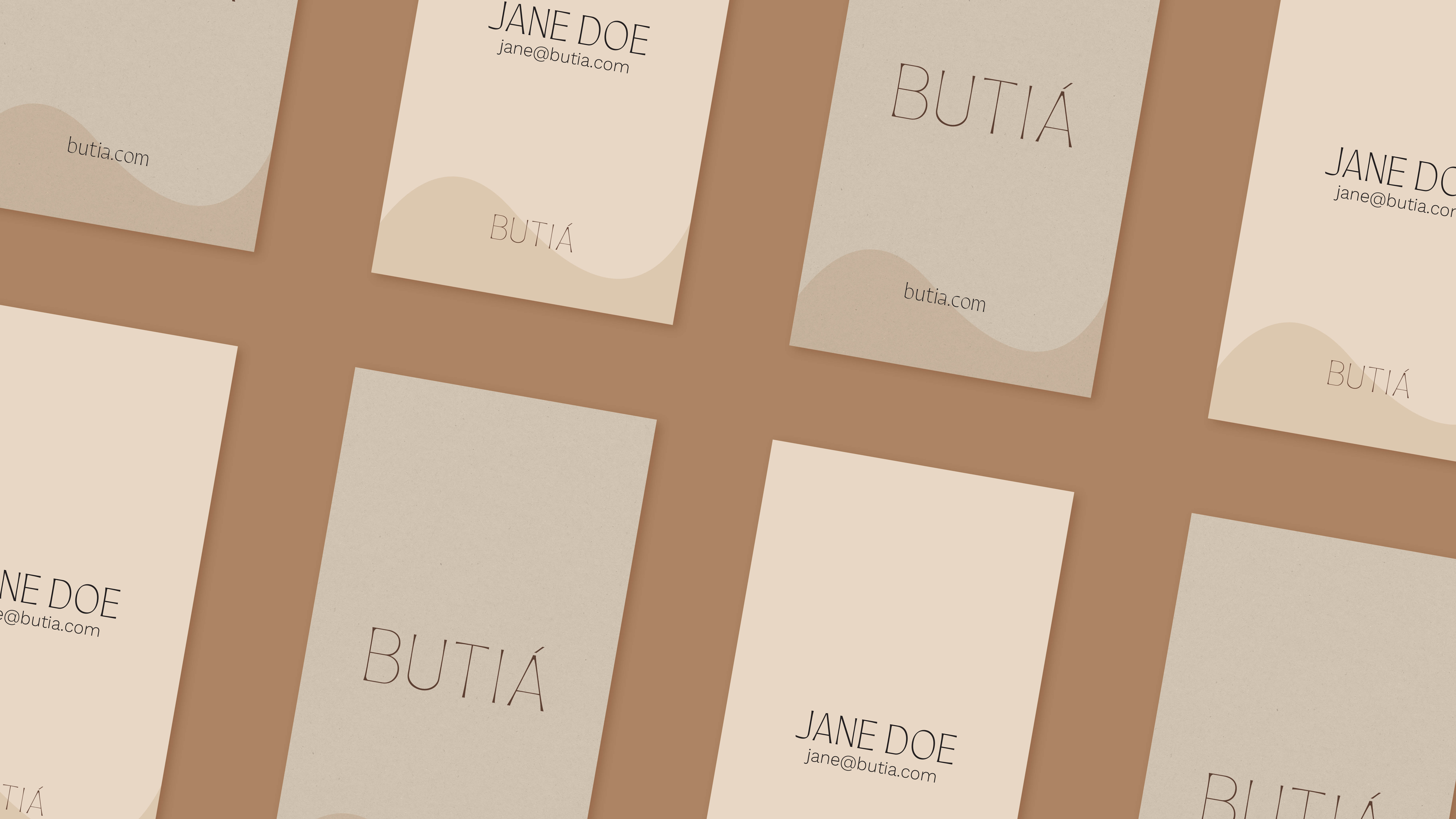
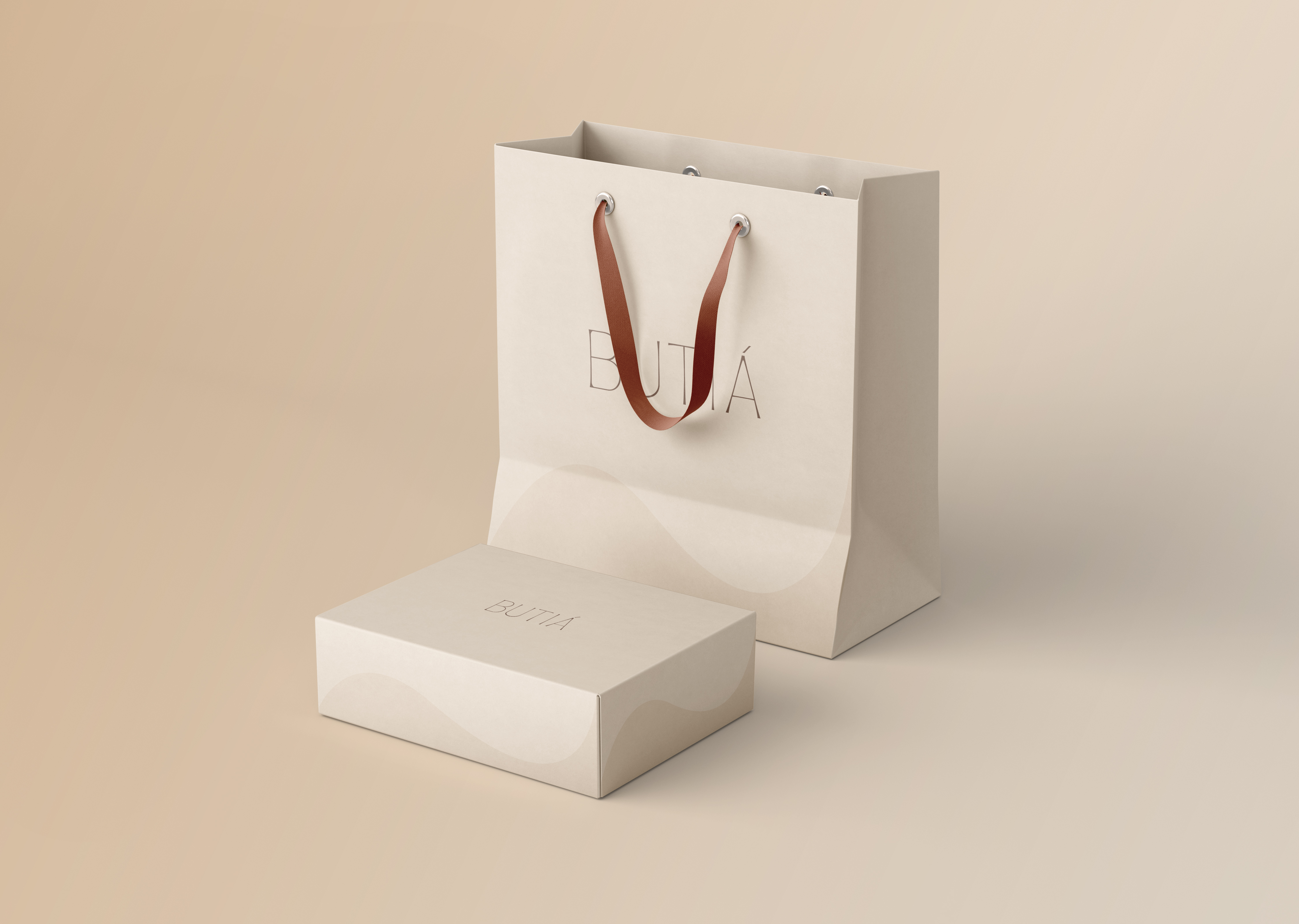
The first application transforms the silhouette into an almost imperceptible presence. Used as a subtle shadow along the base of packaging, stationery, and other materials, it adds depth without competing with the primary elements.
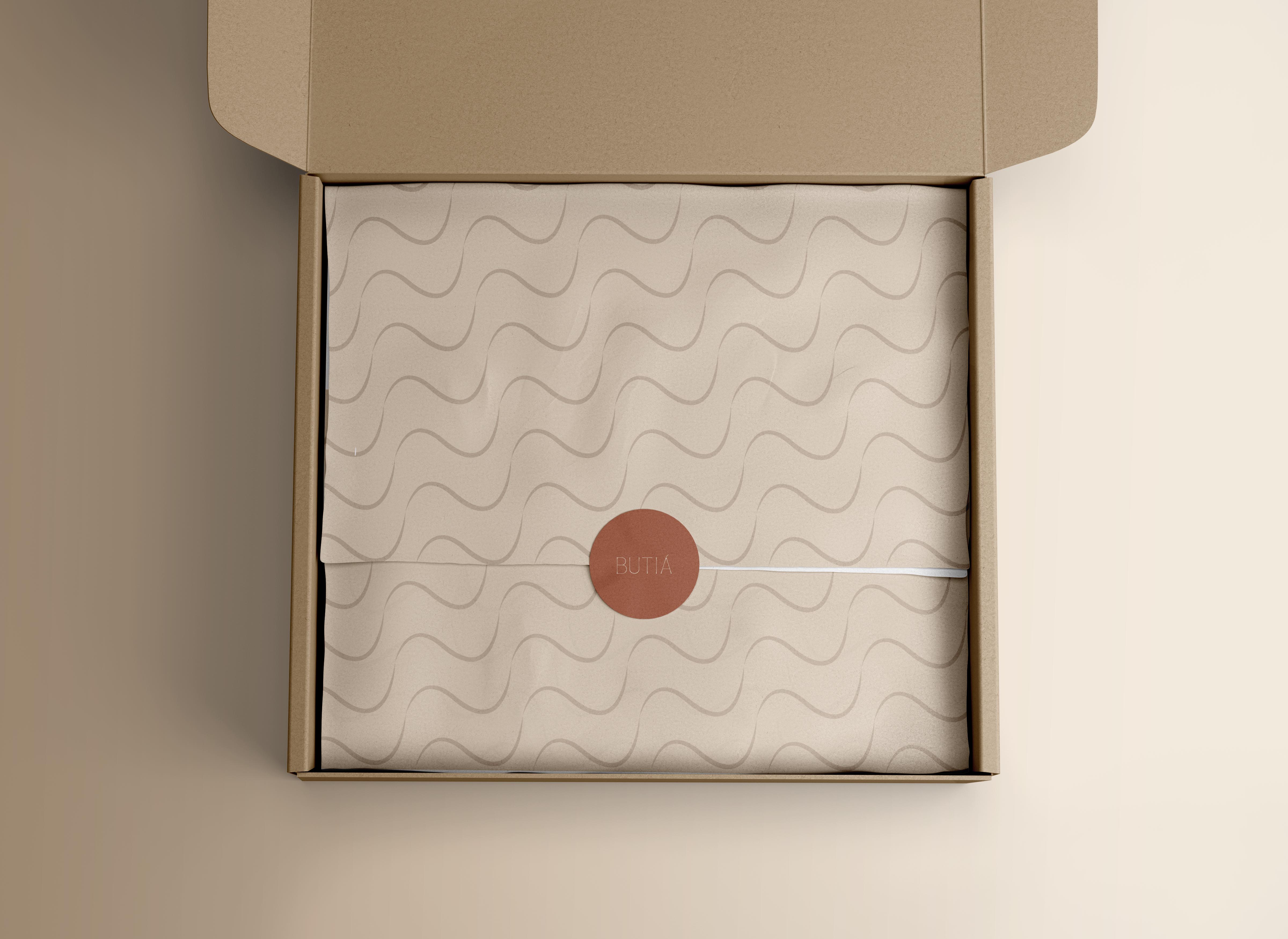
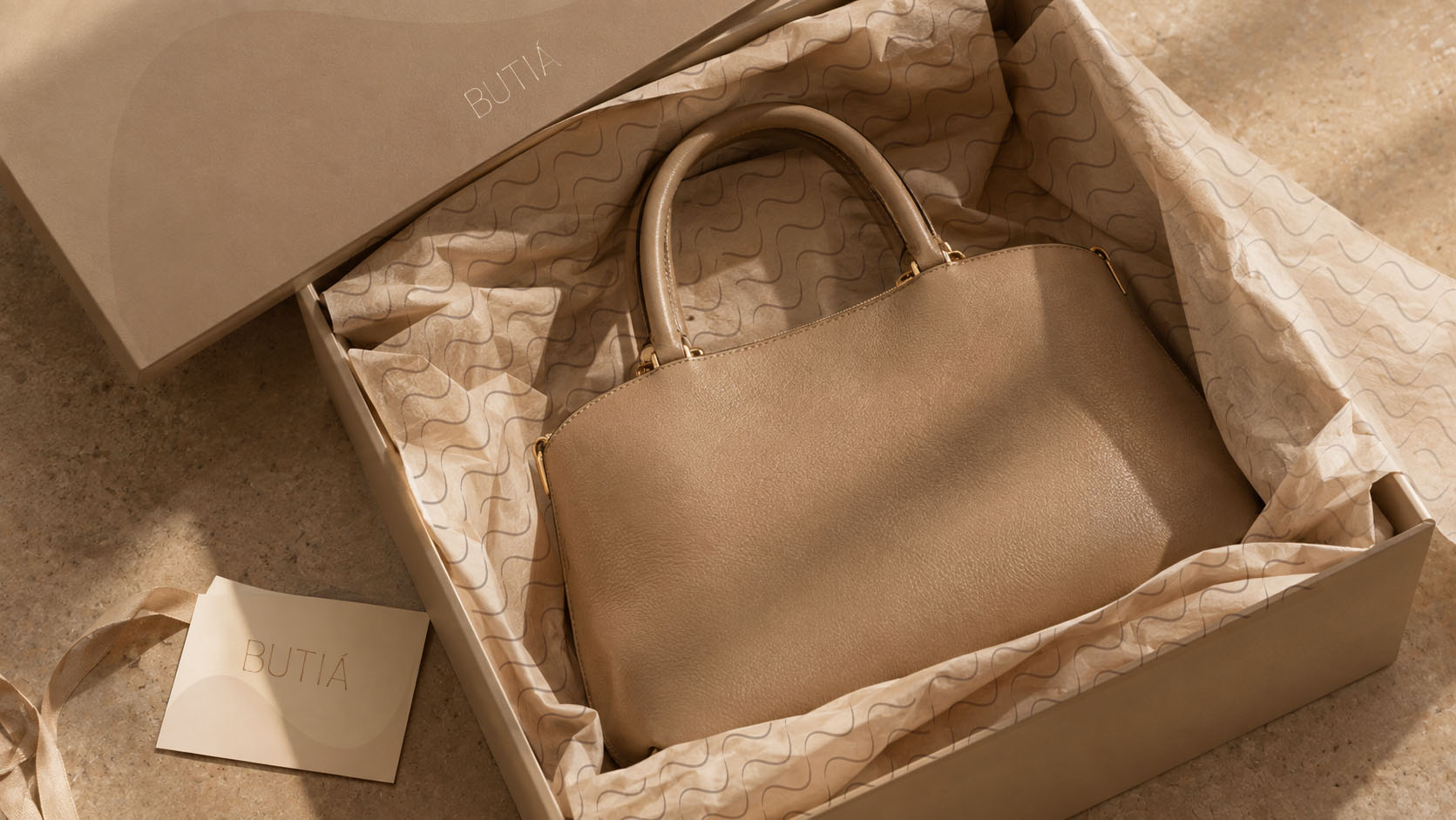
In the second, the same form is repeated to create continuous lines. The result visually brings mountains and waves together, creating an organic, fluid, and versatile graphic element.
The landscape is no longer simply an inspiration.
It becomes part of the brand’s language.


This was our journey with Butiá.
More than creating a visual identity, our work was about translating a worldview into a brand: turning the idea of a quieter kind of luxury, connected to nature, time, and intention, into a distinctive visual language.
We built an identity that finds inspiration in South America, while choosing to reveal it through a new perspective, more contemporary, sophisticated, and subtle.
At IAP Studio, we believe strong brands are born when strategy, sensitivity, and vision come together in an expression designed to endure.
Ivan Canan's identity stems from his own signature to create a visual system based on rhythm, repetition, and modernist curves.
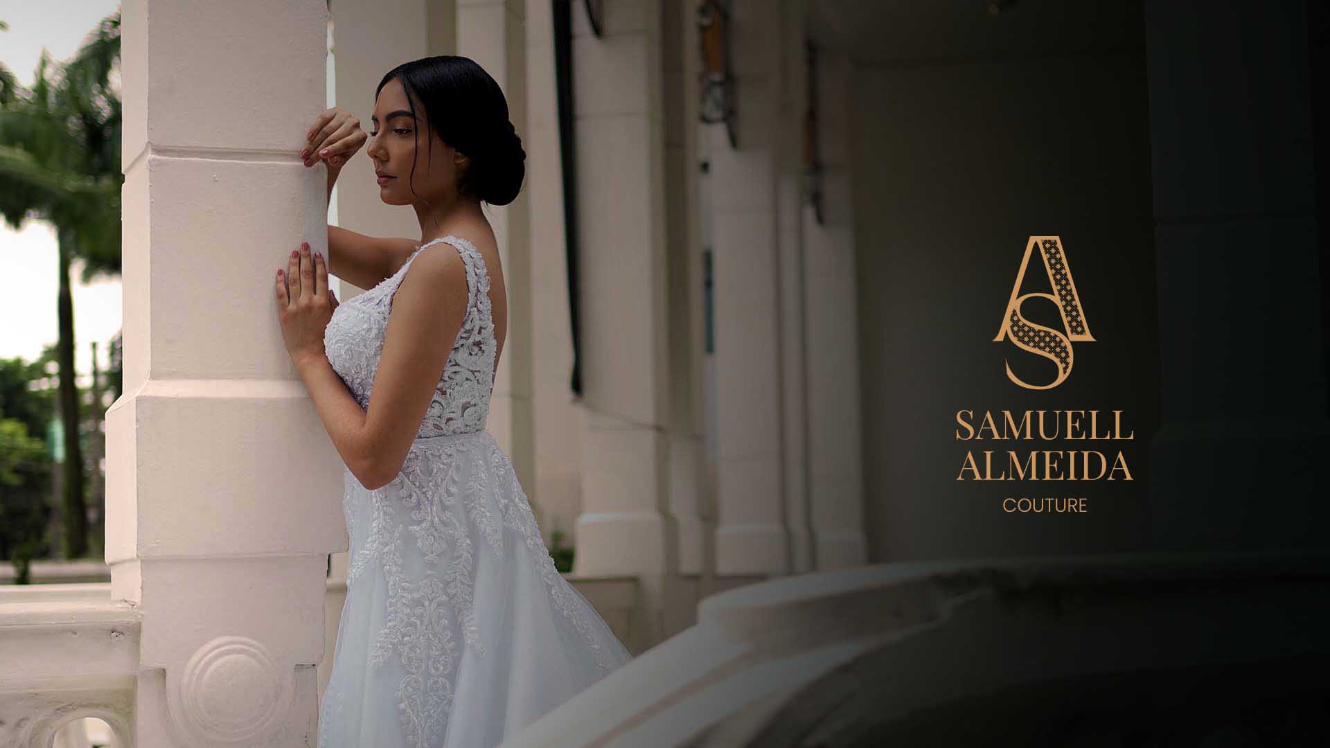
An identity that embodies the world of bespoke design, where every detail carries intention,and is revealed upon closer inspection
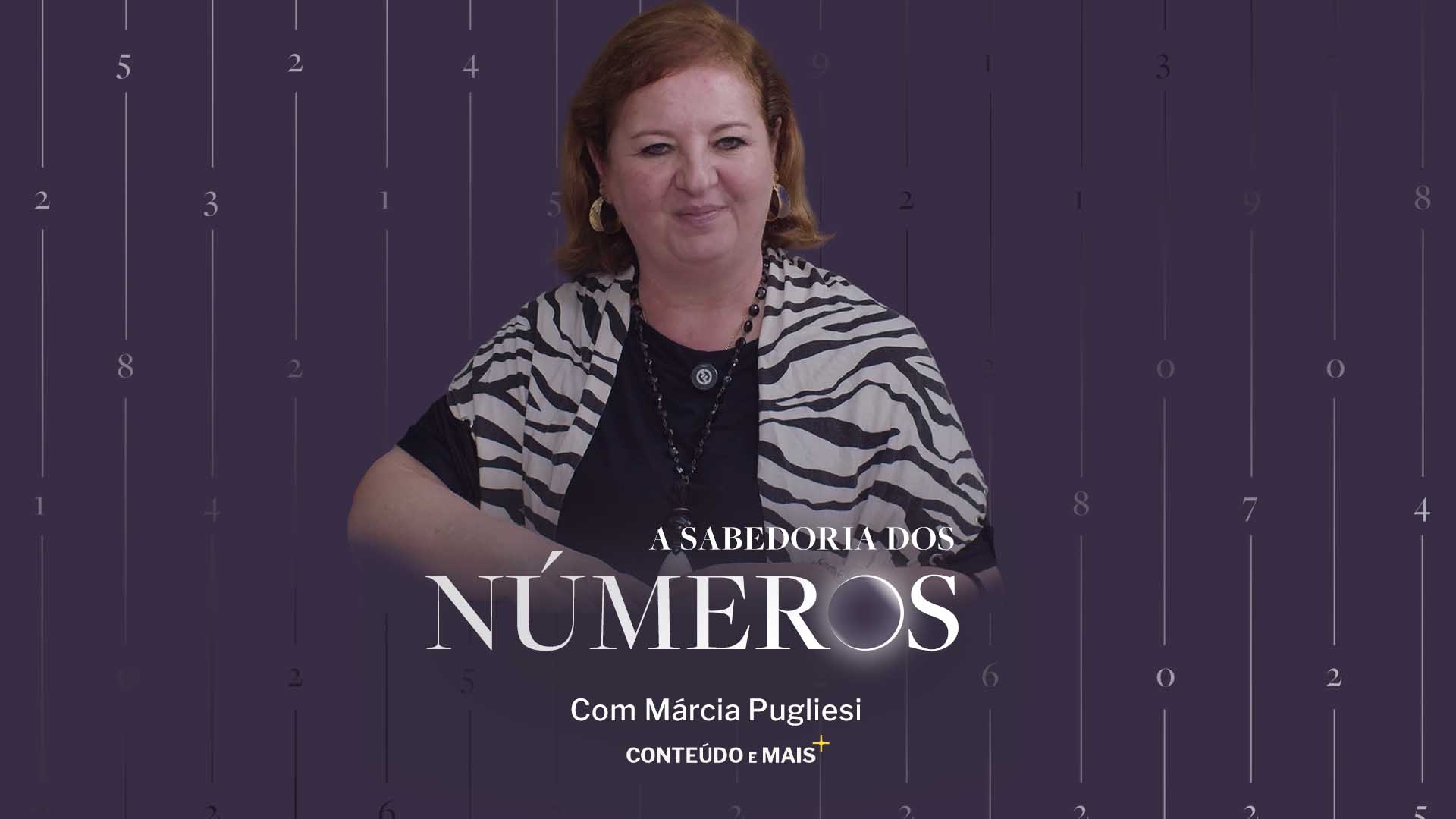
An identity that translates numerology as a language, present in life, in cycles, and in the universe.